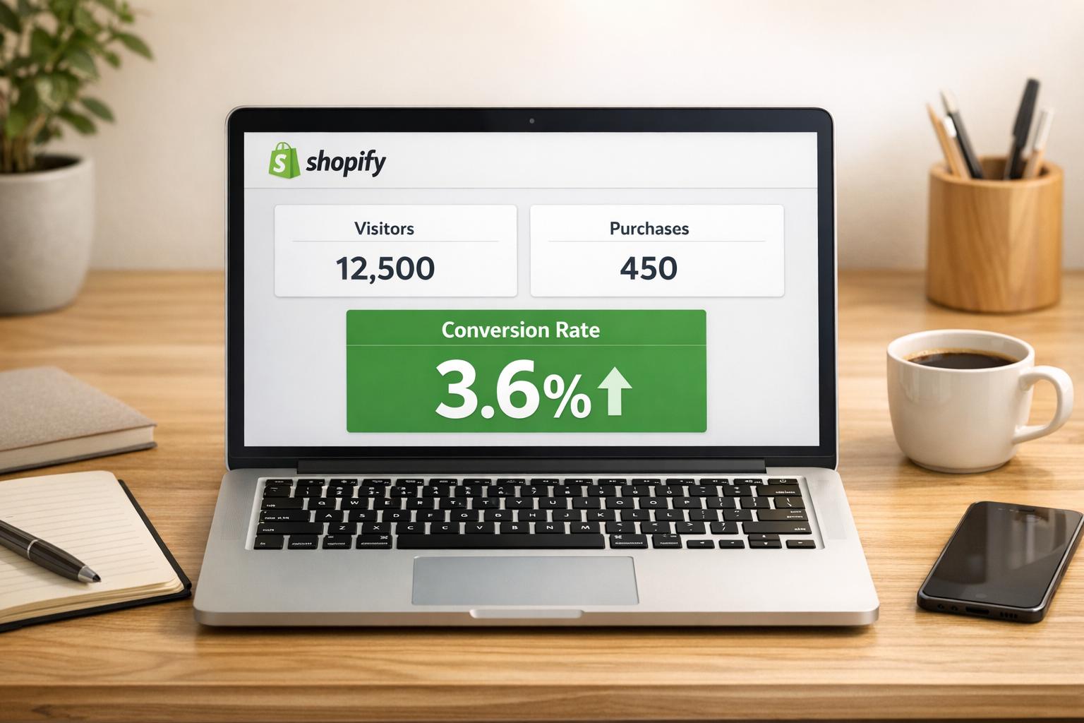
Dynamic variant sorting on Shopify helps customers quickly find the right product options (like size or color) by organizing variants logically and prioritizing in-stock or popular choices. This approach can boost conversion rates by 3.8% and reduce exit rates by 1.9%. Shopify uses tools like ProductVariantSortKeys and the Section Rendering API to handle sorting efficiently, even for large catalogs.
Key takeaways for better variant sorting:
- Logical Order Matters: Arrange options based on customer behavior (e.g., color first, then size).
- Show Relevant Options First: Highlight in-stock, bestselling, or sale variants upfront.
- Use Clear Selectors: Swatches work well for visual options like colors, while dropdowns suit long text lists.
- Leverage Tools: Apps like Varco let you display individual variants on collection pages for better visibility.
- Optimize for Mobile: Make selectors intuitive with large tap targets and place key info above the fold.
- Track Performance: Monitor metrics like conversion rates and use A/B testing to refine your strategy.
How to Bulk Sort Product Variants in Shopify with Bulk Product Editor

sbb-itb-d9e5b3a
Organize Variant Options Logically
Shopify products allow up to three options (like Size, Color, or Material), and the way you organize them matters. The order you choose directly impacts how customers navigate and make decisions. For instance, if shoppers usually pick a color first and then a size, your variant order should reflect that. Setting Color as Option 1 will group all sizes under each color, while choosing Size as Option 1 will group colors under each size instead.
The sequence you define in the Shopify admin determines how variants are displayed to customers. For products with size options, arrange them logically - like XS, S, M, L, XL - instead of alphabetically, which could create a confusing order. This small adjustment reduces mental effort for customers and makes it easier for them to find what they need. Additionally, analyzing customer behavior can help refine how your options are presented.
Study Customer Preferences
Your store’s internal search data can reveal what customers are looking for. For example, if "black jeans" frequently appears in searches, it’s a clear sign that black should be a featured variant. Pay attention to which attributes - like color, material, or size - generate the most interest, and use those insights to organize your display hierarchy.
Monitor your collection page performance as well. If your view-through rate is above 40%, it indicates strong customer engagement with your current variant order. On the flip side, a rate below 25% suggests that customers may be struggling to find what they want. These metrics can guide you in fine-tuning your sorting strategy.
Display Key Variants First
Products in the top 10 positions get 10 times more clicks than those ranked below 100. Plus, customers spend 57% of their viewing time above the fold, so it’s crucial to display the most relevant variants first.
Use the selected_or_first_available_variant attribute to ensure an in-stock option is shown immediately. This avoids frustration caused by displaying sold-out variants upfront. Push out-of-stock options to the bottom of the selector and prioritize showcasing bestsellers, new arrivals, or items with "Compare at" pricing during sales.
As Liam Griffin from Shopify points out, "Reducing customer effort on the product page, even if only by a few clicks, can have a significant effect on conversions".
For marketing campaigns, take advantage of deep-linking with variant IDs in URLs (e.g., ?variant=ID). This lets you direct customers straight to specific options, such as sale colors or popular sizes. By streamlining the journey from ad to checkout, you make it easier for shoppers to find exactly what you want to promote. A well-thought-out display creates the foundation for improving variant selector design further.
Design User-Friendly Variant Selectors
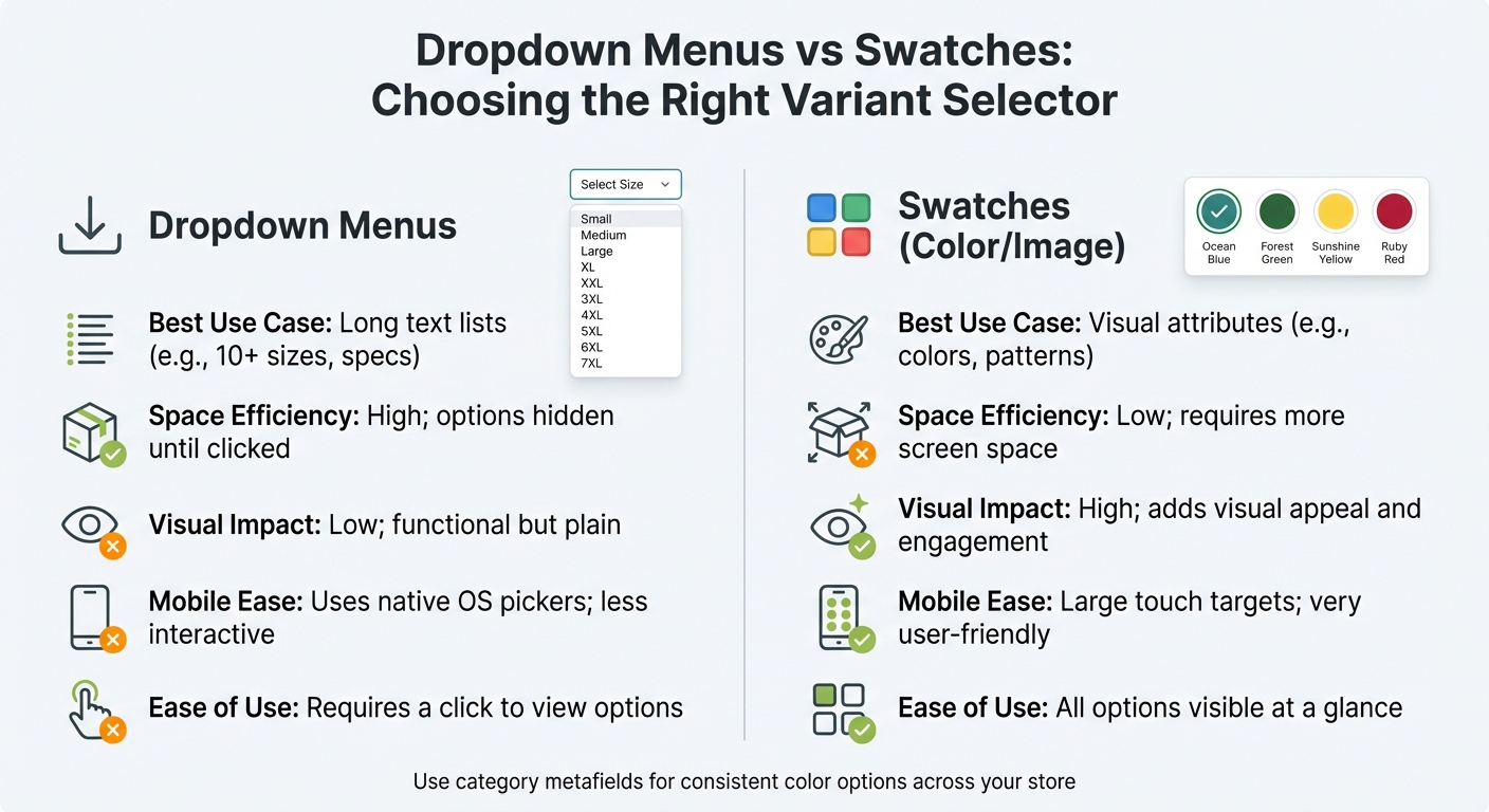
Dropdown Menus vs Swatches for Shopify Product Variants
How you display variant options directly impacts how quickly customers make decisions. Clear and intuitive selectors help reduce confusion and errors, potentially lowering cart abandonment rates. Instead of cramming all variant options into a single dropdown, break them out into separate selectors - for example, one each for size, color, and material.
When a customer selects a variant, it should immediately update product media, price, and availability. This instant feedback keeps users engaged and reassures them about their choices. However, if your store has over 250 variants, the Liquid API may struggle to keep up. In such cases, the Section Rendering API can dynamically load data more efficiently. Now, let’s look at how to format these selectors for maximum usability.
Choose Between Dropdowns and Swatches
Swatches - whether they’re color blocks or image thumbnails - offer a more engaging and interactive experience than dropdown menus. They let customers see colors, patterns, or materials at a glance without needing to click through a menu. This makes them perfect for visually-driven attributes, like fabric textures or paint finishes.
Dropdowns, however, work best for text-heavy options like sizes or weights, especially when there’s a long list to choose from. They save space by keeping options hidden until clicked, which is especially helpful for products with extensive size ranges or technical specifications. On mobile, dropdowns use the device’s native pickers, but they may feel less interactive compared to swatches.
Here’s a quick comparison of the two approaches:
| Feature | Dropdown Menus | Swatches (Color/Image) |
|---|---|---|
| Best Use Case | Long text lists (e.g., 10+ sizes, specs) | Visual attributes (e.g., colors, patterns) |
| Space Efficiency | High; options hidden until clicked | Low; requires more screen space |
| Visual Impact | Low; functional but plain | High; adds visual appeal and engagement |
| Mobile Ease | Uses native OS pickers; less interactive | Large touch targets; very user-friendly |
| Ease of Use | Requires a click to view options | All options visible at a glance |
To ensure consistency across your store, use Shopify's category metafields for color options. For example, if you rename "Black" to "Graphite", all related products will automatically update.
Make Selectors Accessible
A design isn’t truly user-friendly unless it’s accessible to everyone. Variant selectors should work seamlessly for customers using keyboards or assistive technologies. This includes supporting Tab, Enter, Space, and Esc keys, along with visible focus indicators that follow a logical order - top-to-bottom or left-to-right. Additionally, any updates to price or availability triggered by a variant selection should be communicated to screen readers using aria-live.
For mobile and touch devices, ensure that each selector has a minimum touch target size of 44 by 44 pixels. Avoid relying solely on color to convey information - an "out of stock" label, for instance, should also include text or an icon to ensure clarity. Text should meet contrast guidelines: a ratio of at least 4.5:1 for standard text or 3.0:1 for larger or bold text.
Another best practice is to generate unique URLs for each variant using the ?variant=[id] parameter. This allows customers to share or bookmark specific variants and helps search engines index each option individually. For headless or Hydrogen setups, providing links for variants enables prefetching on hover, which speeds up perceived load times. By prioritizing accessibility, you not only meet best practices but also create a smoother shopping experience for everyone.
Use Apps for Advanced Sorting
Once you've nailed intuitive variant selectors, it's time to step up your game with advanced sorting apps. These tools go beyond Shopify's basic sorting features, offering automated merchandising powered by real-time data. Apps like these analyze key metrics - sales volume, inventory levels, profit margins, and even customer reviews - to ensure your top-performing products always shine at the top of your collections. Take Dynasort, for example. It delivers smarter sorting without requiring theme modifications or slowing down your site, so you can enhance your store's functionality without compromising on user experience.
Another bonus? Many of these apps let you create reusable sorting recipes. This is a huge time-saver and keeps your store consistent. For instance, you can design a recipe that prioritizes products with stellar reviews and solid inventory levels, then apply it across all your seasonal collections. The app takes care of the rest, updating your collections every 10 minutes (depending on your plan). Next, let’s dive into a specialized app that transforms how variants are displayed for maximum visual appeal.
Use Varco for Variant Display on Collections
If your products have multiple colors, patterns, or styles, showing each variant as a separate item on your collection pages can boost visibility and engagement. That’s where Varco comes in. This app allows you to display each variant individually within the collection grid, making all options visible to customers upfront. It’s a game-changer for visually driven products like clothing, shoes, or home decor.
PARADE, a brand using variant-splitting apps, shared: "The app lets us showcase our many variant options on any of our collection pages, and has the ability to hide specific variants from collection pages once they're out of stock".
Sole Desire Shoes highlighted: "We sell shoes, having all the colors show up on the collection page is key, many people see a red shoe totally differently than a black shoe, and won't even click without seeing the color they like".
By presenting all color options right on the collection page, you make shopping easier for customers who prefer visual browsing over dropdown menus.
Varco also lets you set rules for displaying variants in specific collections. For instance, you can configure it to show only blue variants in a summer-themed collection. Plus, it automatically hides out-of-stock variants, keeping your store's presentation clean and accurate. This eliminates the need to manually duplicate products, which can lead to messy product IDs and complicated inventory management.
Improve Variant Images and Media
High-quality visuals for each product variant can make a big difference in how customers feel about their purchase. In fact, products with multiple images can boost conversion rates by as much as 30%. Clear, detailed media not only reduces confusion but also sets proper expectations, helping to lower return rates.
Just like logical ordering makes choosing easier, displaying the right image for the selected variant confirms the customer’s choice. For example, if a customer clicks on a blue shirt instead of a red one, they should immediately see the blue version - not a generic product shot. This instant visual feedback helps reduce decision fatigue. Let’s dive into how consistent styling can further enhance the shopping experience.
Keep Image Styling Consistent
Uniformity in your product images makes your store look polished and professional. Use the same camera angle, lighting, background, and zoom level for all variants. This consistency makes it easy for customers to compare options. Stick to a resolution of 2048 x 2048 px and ensure all images share the same aspect ratio. Why? It prevents layout shifts when customers toggle between variants.
For file formats, use JPG for standard product photos and PNG for images needing transparent backgrounds. Tools like TinyPNG or Shopify's built-in optimizer can compress images to maintain fast page load speeds. Don’t forget to add descriptive alt text for each image - for instance, "Red leather wallet with gold zipper, top view." This not only improves accessibility but also boosts SEO. Once your images are consistent, focus on linking them accurately to their variants.
Link Media to Specific Variants
Shopify doesn’t automatically pair images with specific variants based on filenames or order. You’ll need to manually assign images through the admin panel or use structured data tied to SKUs. This ensures that when a customer picks a variant, the right image appears, eliminating confusion. For larger catalogs, apps that use SKU-based or metafield-based matching can automate this process and save you time.
For products with intricate details, consider adding videos or 3D models to specific variants. Shopify supports video uploads up to 1 GB, with a maximum length of 10 minutes and resolutions up to 4K (3840x2160). Including these media types can elevate the shopping experience and give customers the confidence to hit "Add to Cart."
Make Sorting Work on Mobile Devices
As of July 2025, more than 64% of global web traffic comes from mobile devices. This shift reflects how people shop today. Mobile users make decisions quickly - often in seconds - and typically view fewer than 10 products before deciding to stay or leave. That first row of product variants is critical for grabbing their attention.
The stakes are high. Mobile checkout abandonment sits at a staggering 85.7%, compared to 73.8% on desktop. Greg Bernhardt, SEO Strategist at Shopify, highlights the challenge:
"Think critically about how people use desktop experience versus mobile. If they have 30 seconds on a packed subway, they don't have time to process and scroll".
To meet these challenges, your mobile design needs to match how shoppers actually behave.
Tips for Mobile-Optimized Variant Selectors
Start by making interactions easier and more intuitive. Replace dropdown menus for color and size options with swatches - they’re quicker to scan and tap on small screens. Ensure tap targets are at least 48 pixels wide to avoid frustrating "fat-finger" errors [35,36]. Keep your add-to-cart button sticky, so it stays visible as users scroll through product details [36,37]. And don’t hide key information - place variant selectors, prices, and purchase buttons above the fold, eliminating the need for scrolling.
For products with multiple options, use collapsible accordions to keep the interface tidy while ensuring all details remain accessible [35,37]. This approach reduces scroll fatigue and keeps shoppers focused. Why does this matter? 90% of shoppers who enjoy a smooth mobile experience are likely to return, compared to only 50% of those who encounter a poor one. Even a one-second delay can slash mobile conversions by up to 20%.
Test on Real Devices
Don’t rely solely on simulators like Chrome DevTools - test your design on actual smartphones. Real devices reveal friction points that simulators might miss. Pay special attention to how variants appear in the first row, as this is where mobile shoppers make snap decisions. Highlight your best-sellers, trending items, or high-margin variants in this prime spot to capture attention [43,40].
These adjustments not only enhance mobile usability but also strengthen your overall variant sorting strategy, ensuring shoppers enjoy a seamless experience no matter the device.
Apply Tags and Filters for Organization
Taking product organization to the next level involves using precise tags and filters to streamline the shopping experience.
Shopify's storefront filters are a step up from manual tagging, as they use your existing product data - like variant options, pricing, and availability - to make browsing more intuitive for customers. These filters can be set up at two levels: product-level (e.g., vendor, product type) and variant-level (e.g., size, color, specific prices).
Variant-level filters come with an added bonus: deep-linking. For example, if a shopper selects "Blue" and "Size L", the featured image and URL update dynamically to show the first matching variant. This eliminates the need for customers to sift through generic product pages, letting them land directly on what they want.
To manage your filters, use the Search & Discovery app. This tool allows you to create up to 25 unique filters, each capable of displaying up to 100 values to customers. You can also group similar variant names (like combining "Onyx", "Ebony", and "Midnight" under "Black"). For size filters, switch to manual sorting so sizes appear logically (e.g., XS, S, M, L, XL) rather than alphabetically (L, M, S, XL, XS).
Another useful tip: configure your filters to hide or demote out-of-stock variants. This avoids frustrating situations where customers click on unavailable options. You can also use metaobject references to display color swatches for a more visually engaging experience.
Keep in mind that collections with more than 5,000 products or search results exceeding 100,000 items will automatically hide filters. Additionally, for collections that surpass these limits, it may take 24–48 hours for new variant data to appear due to automatic re-indexing. These filtering strategies work seamlessly with your variant sorting approach, creating a smoother shopping journey for your customers.
Test and Track Variant Performance
Once you've fine-tuned your sorting and filtering system, it's time to see how well it performs. Tracking the performance of each variant helps you identify the setups that yield the best results. Start by monitoring conversion rates for individual variants - this reveals how effectively different colors, sizes, or styles convert casual browsers into paying customers. If one variant consistently outperforms others, consider giving it a more prominent position.
Beyond conversion rates, tools like heatmaps can provide deeper insights. For example, heatmaps show where shoppers are clicking on your color swatches or dropdown menus. This data can help you refine your merchandising strategy, which could lead to a potential 30% increase in add-to-cart rates. On the flip side, frequent clicks on unavailable variants might indicate you need to adjust your sorting logic to better align with inventory.
Monitor Conversion Rates
To truly understand profitability, look beyond basic sales data. Track metrics like sales volume, revenue per unit, inventory turnover, and average order value (AOV). These numbers give you a clearer picture of which variants are driving actual value after factoring in costs like production and marketing.
Keep an eye on cart abandonment and return rates for specific variants as well. High rates in either area could signal that the way you're presenting those variants isn't meeting customer expectations. And remember: 88% of shoppers are unlikely to return to a site after a poor user experience. These insights can guide you toward targeted A/B testing to refine your variant setup even further.
Run A/B Tests
A/B testing is a powerful way to compare your current sorting method (the control) with a new approach (the variant) to determine which one drives better results. Start with a clear hypothesis. For example: "Sorting color swatches by popularity will increase add-to-cart rates by 15% because shoppers can quickly identify the best-selling colors".
When running tests, focus on one variable at a time to isolate its impact. Aim for tests that run 2–4 weeks, with at least 100 conversions per variation and a 95% confidence level to ensure reliable results. For example, if your page has a 2% conversion rate, you'll need about 5,000 visitors per variation to achieve statistical significance.
Leading ecommerce brands often run between 24 and 60 A/B tests annually. For instance, Dr. Squatch, an organic soap company, worked with SplitBase to test defaulting their product page to a quantity of two soaps instead of one. This simple change led to a 54% increase in revenue per user. Another example comes from INH, a hair extension brand, which tested using GIFs instead of static images on product pages. The result? A 26% boost in conversions and better return on ad spend. These examples highlight how thoughtful testing can shape your approach to variant sorting and presentation, ensuring your strategy continues to evolve and improve.
Common Mistakes and How to Fix Them
Even experienced store owners can stumble when it comes to managing variant sorting. These missteps can lead to confusion, slower performance, and reduced customer engagement. Below, we’ve outlined some frequent errors, their effects, and how to address them effectively.
Mistakes and Solutions Table
| Mistake | Impact | Solution |
|---|---|---|
| Loading all variants via Liquid for high-count products | Slows page rendering; breaks code if variants exceed 250, hiding additional variants from customers | Use the Section Rendering API and the product_option_value object to load variant data dynamically instead of all at once |
| Static display of price or media | Displays incorrect prices or images for selected variants, reducing customer trust and increasing cart abandonment | Use JavaScript to update product media, price, and variant selectors immediately when a customer makes a selection |
| Alphabetical sorting for sizes | Sizes appear out of order (e.g., Large, Medium, Small, XL instead of Small, Medium, Large, XL) | Use size-based or numeric sorting logic instead of default alphabetical order |
| Ignoring deep link support | Shared links or ads direct customers to the default variant instead of the advertised one, causing frustration | Enable handling for ?variant= and ?option_values= query parameters to ensure customers land on the correct variant |
| Manual naming of variant values | Inconsistent naming (e.g., "Black" vs "Graphite") complicates store-wide updates and fragments filtering | Use category metafields to create consistent and reusable variant options across your store |
| Suboptimal option sequence | Variants are grouped in an unnatural order (e.g., sorting by Size before Color), disrupting the shopping flow | Arrange options so the most critical choice appears first - Shopify groups variants based on the first assigned option |
Shopify sets a limit of three options and 2,048 variants per product. If your store exceeds these limits, consider using third-party apps or leveraging line item properties. For stores with over 50,000 variants, note that there’s a daily upload cap of 1,000 new variants unless you’re on Shopify Plus.
Conclusion
Dynamic variant sorting enhances sales by organizing options logically, spotlighting best-sellers, and instantly updating images and prices. This creates a seamless shopping experience. The numbers don’t lie: products in the top 10 positions of a collection page get 10 times more clicks than those further down the list. This approach lays the groundwork for a merchandising strategy that prioritizes conversions.
However, Shopify’s limit of 250 product.variants per collection can make manual sorting impractical as your catalog expands. That’s where automation comes in. Studies reveal that automation can lead to a 3.8% increase in conversion rates and a 1.9% decrease in exit rates. Tools like Varco align perfectly with these best practices, simplifying the process and improving results.
With Varco, you can split products into individual variants and display them directly on collection pages - no complicated theme changes required. Whether your catalog is simple or complex, automation tools like this allow you to focus on refining your merchandising strategy.
Take the time to audit how your variants are displayed, experiment with different sorting methods, and track conversion rates to fine-tune your approach. Avoid common pitfalls by following the checklist provided. By combining smart organization, mobile-friendly designs, and effective tools, you can elevate customer engagement and drive more sales.
FAQs
How do I choose the best option order (color vs size) for my products?
When organizing the order of product options, think about how customers usually shop and what they’re likely to prioritize. Shopify allows you to adjust the order of variants directly in the product page settings. Arrange options like size or color so the most popular choices - like bestsellers or commonly preferred variants - are front and center. This makes shopping more intuitive, helping customers find what they want faster and potentially increasing sales.
What should I do if my product has more than 250 variants?
Shopify allows up to 2,048 variants per product, but there's a catch - your theme can only load 250 variants at a time. This limitation is in place to maintain performance. To work around this, you can use tools like the product_option_value API and dynamic loading. These methods help display only the variants that are relevant to your customers.
It's also crucial to ensure your theme and any apps you use are compatible with this higher variant limit. Failing to do so could lead to problems like missing variants or slower load times, which can negatively impact the shopping experience.
How can I deep-link to a specific variant from ads or emails?
To link directly to a specific product variant on Shopify, you just need to add ?variant=[variant-id] at the end of the product URL. This makes sure the product page opens with the selected variant already highlighted.
Here’s how you can do it:
- Locate the variant ID: You can find this in your Shopify admin under the product's variant details.
- Update the product URL: Simply append
?variant=[variant-id]to the product link. - Share the updated link: Use this customized URL in your marketing campaigns, like ads or emails, to streamline the shopping experience for your customers.
This small tweak can make it easier for customers to find exactly what they’re looking for.