Aesthetic consistency can directly impact how visitors perceive and interact with your Shopify store. When your design elements - like colors, fonts, layouts, and videos - are visually aligned, it builds trust and creates a smoother shopping experience. This trust is critical, as poor design can contribute to the 75% of shoppers who abandon their carts. For video-heavy stores, aligning video styles with your site's overall look is even more important to avoid confusing or distracting users.
Key Takeaways:
- First Impressions Matter: Users decide within seconds whether to stay on your site.
- Consistency Builds Trust: Unified visuals make your store look polished and professional.
- Boosts Conversions: Cohesive design can reduce cart abandonment and increase sales.
- Psychology at Play: Familiar design patterns reduce mental effort and improve user comfort.
- Video Alignment: Matching video styles (e.g., color grading, typography) with your site enhances engagement.
By maintaining a consistent aesthetic across all elements, including videos, you create a more reliable and engaging experience for users, ultimately driving higher conversions.
What Aesthetic Consistency Means for Shopify Stores
Aesthetic consistency is all about creating a unified and recognizable look across every interaction a customer has with your brand - whether that's your homepage, product pages, email campaigns, or even your social media presence. It’s not just about making things look good; it’s about sticking to key elements like colors, fonts, and messaging that help build trust and make your brand memorable.
In Shopify design, consistency is built on two main ideas: aesthetic formality (think structure, symmetry, and order) and aesthetic appeal (the creativity that makes your store visually engaging). Formality ensures your site feels organized and user-friendly, while appeal adds that extra spark to keep visitors interested. Together, these aspects make your store feel polished and reliable.
"A consistent brand is one that preserves its aesthetic, messaging, and values no matter where it surfaces." – Dayna Winter, Shopify
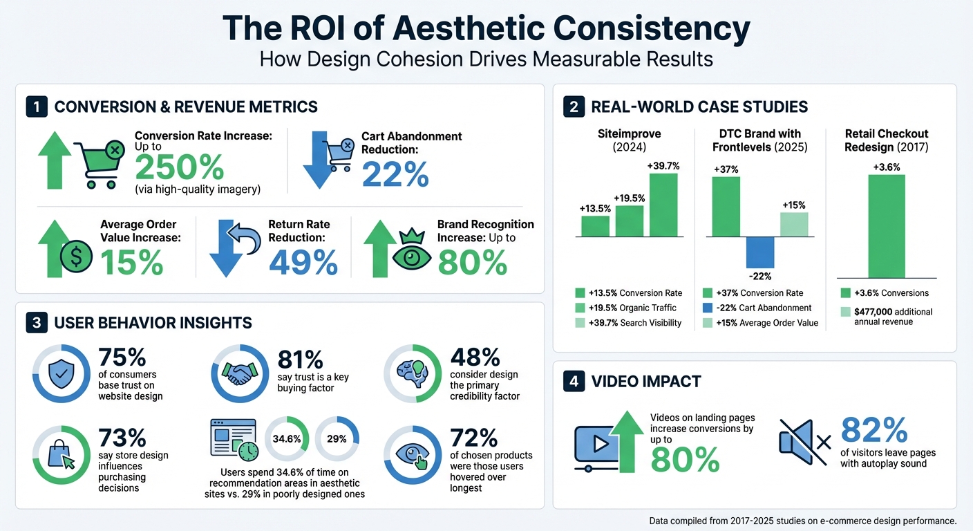
And this isn’t just theoretical - better design can directly impact your bottom line. For instance, one retailer improved their checkout form design and saw a 3.6% boost in conversions, adding over $450,000 in annual revenue. A cohesive, well-designed store doesn’t just look good; it builds trust and encourages customers to buy.
Core Elements of Aesthetic Consistency
Creating a visually consistent Shopify store involves aligning several key design elements. These elements work together to shape your brand’s identity:
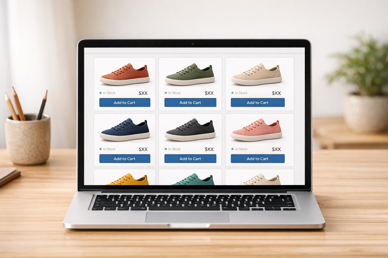
- Color schemes: Successful stores often stick to 2–3 primary colors to set the mood and avoid visual clutter.
- Typography: Using one font for headings and a different one for body text helps reinforce your brand’s personality while improving readability.
- Layout and spacing: Consistent margins and generous white space make your store feel clean and organized, helping users focus on what’s important.
- Visual hierarchy: Arranging elements by size, color, or position naturally guides visitors’ eyes, reducing confusion and building trust.
- Motion and animation: Smooth transitions add a professional touch, while abrupt or inconsistent animations can disrupt the experience.
As Kelley Gordon from Nielsen Norman Group puts it:
"Visual hierarchy controls the delivery of the experience. If you have a hard time figuring out where to look on a page, it's more than likely that its layout is missing a clear visual hierarchy."
When these elements are in sync, they create a shopping experience that feels purposeful and reliable. Take the gummy worm brand Rotten, for example. In November 2023, they used an ‘80s punk-inspired design, gross-out humor, and a bold color palette across their Shopify store, YouTube channel, and retail displays to maintain a unified aesthetic. Similarly, Different Puzzles mirrored the artistic vibe of its products by using retro-style images and quirky, casual copy on Instagram, product pages, and even FAQ sections.
When adding video content to the mix, keeping these elements consistent becomes even more critical to avoid a jarring experience.
Aesthetic Consistency in Video-Driven Stores
For Shopify stores that rely heavily on video - whether through YouTube widgets, product demos, or galleries - maintaining consistency can be tricky but highly rewarding. Videos introduce more layers of complexity, and if they clash with your site’s overall design, they can erode user trust. To avoid this, ensure that your videos match your brand’s visual style. Elements like color grading, lighting, and motion should align with your site’s aesthetic. For instance, if your product pages feature soft, natural lighting, your videos shouldn’t suddenly shift to harsh studio lighting or drastically different color tones.
In 2023, the haircare brand Squigs nailed this approach by using consistent imagery, models that resonated with their audience, and carefully chosen color palettes across their site and in collaborations with retailers like Urban Outfitters. The same principle applies to video - when your video content aligns with your static design elements, it reinforces your brand’s professionalism and keeps users engaged. Research shows that in visually cohesive stores, users spent 34.6% of their time focusing on recommendation sections, compared to just 29% in stores with poor design.
How Aesthetic Consistency Affects User Behavior and Conversions
Impact of Aesthetic Consistency on Shopify Conversion Rates and User Engagement
A unified visual identity on your Shopify store does more than just make it look polished - it transforms how customers interact with your brand. Consistent design builds trust, directs attention, and encourages purchasing decisions. In fact, cohesive design elements can directly lead to higher conversion rates, as studies show that visual harmony not only enhances trust but also creates a smoother path to purchase.
Psychology Behind Consistent Design
The concept of cognitive fluency explains why consistent design works so well. Familiar patterns and visual cues make navigation feel effortless, allowing users to focus on your products rather than figuring out how to use your site. This ease of interaction creates a sense of comfort and familiarity that encourages users to stay engaged.
"When a user doesn't have to re-learn how to interact with different parts of your site, they can focus on what matters - making a purchase or signing up for your service." – Kinga Edwards, WebWave
This effect ties into the aesthetic-usability phenomenon, where visually appealing websites are perceived as easier to use - even when their functionality is identical to less polished sites. It's no surprise that nearly half of users consider website design the primary factor in judging a business's credibility, and 75% base their trust in a company on its website design alone. On the flip side, inconsistencies - like mismatched fonts on your checkout page or clashing colors in your video content - can confuse users and cause them to question if they’re still in the right place.
Neuroscience backs this up: studies show that high-quality, consistent design aesthetics require less mental effort to process and evoke more positive emotional responses. Inconsistent design, however, creates cognitive friction, disrupting the user's experience and eroding trust. This matters because trust is a dealbreaker - 81% of consumers globally say it’s a key factor in their buying decisions. A visually cohesive site signals reliability and professionalism, while a disjointed one can undermine those perceptions.
These psychological and emotional responses aren't just theoretical - they translate directly into measurable improvements in conversion metrics.
Conversion Metrics Linked to Aesthetic Consistency
For Shopify stores, especially those relying on video content, the numbers speak for themselves. Consistent design doesn’t just improve the user experience - it delivers tangible business results.
Take Siteimprove, for example. In 2024, they revamped their brand visuals, swapping their corporate blue for electric lime green and neutrals, streamlining web components with a centralized design system, and introducing custom icons. The results? A 13.5% increase in conversion rates, a 19.5% boost in organic traffic, and a 39.7% rise in search visibility.
Another case comes from a direct-to-consumer brand working with Frontlevels in 2025. By implementing a custom Shopify theme focused on brand consistency, mobile-first design, and performance optimization, the brand saw a 37% spike in conversion rates, a 22% drop in cart abandonment, and a 15% lift in average order value - all within three months.
Even smaller tweaks can pay off. In 2017, Conversion.com redesigned a checkout form for a retail client, simplifying text fields, adding white space, and aligning the design with the brand's luxury image. The result? A 3.6% boost in conversions, which translated to an extra $477,000 in annual revenue.
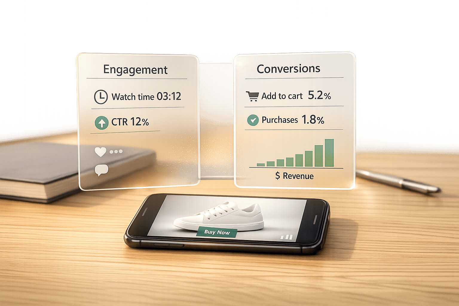
Eye-tracking studies also highlight how consistency shapes user behavior. Research on online fashion stores found that users spent 34.6% of their time in the recommendation area of aesthetically pleasing sites, compared to 29% on less polished ones. Products marked with tags like "Eco" or "New" captured 7.04% of total fixation time on aesthetic sites versus 5.93% on others. Notably, 72% of the products users ultimately chose were the ones they hovered over the longest.
| Metric | Impact of Consistent Design | Source |
|---|---|---|
| Conversion Rate | Up to 250% increase (via high-quality imagery) | |
| Cart Abandonment | 22% reduction | |
| Return Rate | 49% reduction | |
| Average Order Value | 15% increase | |
| Brand Recognition | Up to 80% increase |
For stores driven by video content, consistency is even more critical. Videos that align with your site’s overall design - matching in color grading, lighting, and motion - reinforce a professional and cohesive brand image. This matters because 73% of consumers say a store’s design directly influences their purchasing decisions.
"When every piece fits together, customers trust your brand and don't lose sight of what brought them to your site in the first place." – Saphia Lanier, Marketer and Strategist, Siteimprove
These statistics underline one key takeaway: maintaining aesthetic consistency isn’t just about looking good - it’s about driving results. For video-driven stores especially, aligning visuals across all touchpoints can significantly boost trust, engagement, and conversions.
sbb-itb-d9e5b3a
How to Apply Aesthetic Consistency to Video-Driven Shopify Stores
A cohesive design not only enhances the user experience but also plays a crucial role in boosting conversions. By ensuring aesthetic consistency across all elements, you create a seamless and unified brand experience.
Aligning Design Elements Across Videos and Pages
Your videos should blend effortlessly with the overall look and feel of your store. Start by sticking to a consistent color palette - make sure video backgrounds, overlays, and graphics align with your site's colors. Similarly, keep typography uniform; if your site uses a bold sans-serif font for headlines, carry that into your video text as well.
The pacing and tone of your videos should also reflect your brand's personality. For example, fast cuts and energetic music can convey excitement and urgency, while slower transitions with softer tones suggest a calm, lifestyle-oriented vibe.
Pay attention to video thumbnails, too. Use a consistent 16:9 ratio, framing, and color grading to avoid jarring inconsistencies. A brand style guide can be a game-changer, covering details like logo placement, font choices, and image treatments. This ensures that as your team or freelancers create new content, the overall aesthetic remains intact.
To make this process easier, consider using Shopify apps designed to streamline design consistency.
Using Shopify Apps to Maintain Consistency
Shopify apps can simplify the process of keeping your store visually cohesive. For video-heavy stores, tools like UWidget allow you to embed YouTube videos in galleries, carousels, or sticky formats. You can customize colors, button styles, and layouts to match your brand's guidelines.
ILikeThat offers like buttons tailored to your store's colors and animations, while DivideItUp creates clean dividers between video sections and product details. To ease the checkout experience, CheckIt provides a progress bar that reassures customers by showing how many steps remain.
When customizing app elements like buttons or text, stick to your brand's color palette and typography. If you use animations, opt for subtle transitions that complement your design rather than distracting, overly dramatic effects.
Reducing Visual Clutter While Keeping Impact
Video-driven stores can easily feel overwhelming if too many elements compete for attention. To avoid this, limit the number of displayed elements and focus on simplicity. Studies show that including videos on landing pages can increase conversions by up to 80%.
"Good web designers know when to hold back." – Lucy Carney, Web Designer
Keep product videos under two minutes for maximum engagement. Use white space strategically - not necessarily white but any empty space that allows your content to breathe and directs attention to your videos.
Apps like DivideItUp can help create clear breaks between video content and product details, reducing visual overload. Similarly, CheckIt adds a clean progress bar to guide users through checkout.
Finally, avoid autoplay with sound - 82% of visitors leave pages because of it. If you use autoplay, let it play silently and provide a sound toggle option. This respects user preferences while still delivering visual impact.
Conclusion
Consistency in design isn't just about aesthetics - it's about creating trust and reducing mental effort for your customers. When your video-driven layouts maintain a cohesive look across fonts, colors, and design elements, visitors can focus on what truly matters: your products. As Paul Rand famously said:
"Design is the silent ambassador of your brand".
Research shows that people form first impressions in less than 50 milliseconds, and a consistent design plays a key role in building the trust needed to turn casual browsers into loyal buyers.
Stores with clean, consistent designs often see impressive results, including up to 35% more user engagement and a 30% boost in conversion rates. By lowering cognitive load, you make it easier for users to interact with your site, which directly translates to increased sales.
Achieving this level of consistency in video-driven stores requires the right tools. For example, UWidget lets you embed YouTube videos in a way that aligns with your brand's style. ILikeThat ensures interactive elements match your color scheme, while DivideItUp helps create clean section breaks, keeping your pages visually organized and cohesive.
Start by auditing your store for mismatched fonts, clashing colors, and inconsistent video thumbnails. From there, implement a brand style guide and use specialized apps to maintain uniformity across every page. A well-designed, unified experience not only looks professional but also builds the trust that drives conversions.
FAQs
How does maintaining a consistent aesthetic help reduce cart abandonment?
Creating a consistent aesthetic for your store isn't just about making it look good - it’s about creating a seamless shopping experience. When your store feels polished and professional, it builds trust with your customers. A clear and easy-to-navigate design helps shoppers feel at ease, reducing confusion and the likelihood of abandoned carts.
By keeping distractions to a minimum and ensuring every design element reflects your brand, you simplify the buying process. This makes customers feel more assured about their decisions, increasing the chances they’ll complete their purchase.
How can aesthetic consistency improve my Shopify store's conversions?
Creating a visually consistent Shopify store isn’t just about making it look good - it’s about building trust and encouraging shoppers to complete their purchases. A polished and cohesive design reassures customers that your store is professional and reliable. To achieve this, focus on a few essential design elements:
- Color palette: Stick to a consistent set of colors across video thumbnails, graphics, and user interface elements. This reinforces your brand identity and creates a unified look.
- Typography: Use the same font styles, sizes, and weights for titles, subtitles, and body text. Consistent typography helps avoid visual clutter and keeps your store easy to navigate.
- Logo placement: Place your logo in the same spot throughout your store - whether it’s in the bottom-right corner of videos or at the start and end of animations. This repetition strengthens brand recognition.
- Spacing and layout: Maintain uniform margins, padding, and section dividers. A clean and organized layout makes your store visually appealing and easy to browse.
- Visual assets: Ensure your images, icons, and animations share a similar style and tone. This harmony ties all elements together seamlessly.
- Interactive components: Buttons, progress bars, and other interactive features should not only look consistent but also behave the same way across your store. This improves usability and customer satisfaction.
To simplify the process, tools like Fractal Apps can be a game-changer. Apps such as DivideItUp, UWidget, and CheckIt make it easy to standardize section dividers, video widgets, and checkout progress bars. By integrating these tools, you can create a smooth and visually consistent shopping experience that encourages customers to stick around and make a purchase.
Why is aligning videos important for boosting conversions on Shopify stores?
Properly aligning videos on your Shopify store is key to delivering a polished and visually engaging shopping experience. When videos are thoughtfully positioned and sized to match your store's overall design, they not only enhance the site's structure but also guide visitors naturally through the content. This level of consistency minimizes distractions, helping shoppers stay focused on your message - which can lead to higher conversions.
Aligned videos also play a functional role by creating a clear visual hierarchy. This makes it easier for customers to locate important details, compare products, and confidently complete their purchases. Tools like UWidget from Fractal Apps make it simple to integrate YouTube videos that seamlessly fit your store's layout, ensuring a professional appearance while boosting sales.