Want to make shopping easier for your customers and boost sales? Here's the deal: Displaying product variants (like colors or styles) as individual tiles on collection pages can significantly improve user experience and drive conversions. Instead of hiding options in dropdowns, you put every choice front and center. Here's why it works:
- Improved User Experience: Shoppers can instantly see all available options without extra clicks.
- Higher Sales: Clear visibility of variants reduces friction, leading to more purchases.
- Better SEO: Each variant gets its own URL, helping you rank for specific searches.
- Mobile-Friendly: Easier navigation on smaller screens keeps users engaged.
- Lower Bounce Rates: Quick access to preferred options means fewer users leave your site.
Quick Fact: 84.7% of buyers make decisions based on color. If they don’t see their preferred option right away, you risk losing the sale.
Tools like Varco make implementing this feature simple, with setup in under 10 minutes. For just $29.99/month, you can enhance visibility, streamline browsing, and boost conversions without custom coding. Shoppers can’t buy what they can’t see - make it easy for them.
How To Show Product Variants As Separate Products On Shopify Collection Page

sbb-itb-d9e5b3a
1. Better Shopping Experience for Customers
When shoppers land on a collection page, they tend to scan images rather than read text. Imagine someone searching for a navy blue shirt but only spotting a white one in the grid - they might assume no other colors are available and leave the site.
Now, picture this: instead of digging through dropdown menus on a product page, customers see all available options right from the start. For example, a t-shirt offered in olive, black, and burgundy is displayed as three separate cards. Clicking on the olive card takes the shopper directly to the product page with that color preselected. This setup not only makes browsing easier but also reduces the chances of frustration.
By showing availability upfront - or hiding out-of-stock options - you eliminate wasted clicks. Customers won’t have to deal with the disappointment of selecting an unavailable option, which saves them time and keeps their shopping experience smooth.
Take Carhartt WIP's "Chester T-Shirt" collection as an example. Each color is presented as its own product card, giving every variant equal visibility. Shoppers can instantly find their preferred shade without having to navigate further.
"Customers make decisions faster when they can see what's available upfront. By cutting out the extra clicks between collection and product pages, you remove unnecessary friction." – Starapps
This simplified approach not only values your customers' time but also boosts the likelihood of conversions.
2. Higher Sales and Conversion Rates
Making the shopping experience smoother doesn’t just please customers - it boosts sales too. When buyers can easily pick the exact variant they want, they’re more likely to complete their purchase. For context, the average conversion rate for a Shopify store hovers around 1.4%, while top-performing stores hit rates between 3% and 5%. Even a small increase in conversion rates - just one percentage point - can translate into hundreds of thousands of dollars in extra annual revenue, all without increasing ad spend.
Imagine visiting a product page and finding your favorite color or size buried in a dropdown menu. Frustrating, right? Now picture seeing those options displayed clearly on the page, ready to click and add to your cart. Some setups even allow customers to add variants directly from the collection grid, cutting down the steps to purchase with just one click.
Take premium fashion house Aje, for example. In 2025, they revamped their mobile storefront on Shopify Plus, focusing on better navigation and visual clarity. The result? A whopping 135% increase in their conversion rate. Similarly, TimberIN, an outdoor wellness manufacturer led by Dr. Albertas Klovas, introduced real-time social proof notifications the same year. This simple tweak reduced hesitation among visitors and boosted sales by 6%–8%.
This impact is even more pronounced on mobile devices, which are expected to account for 63% of e-commerce by 2028. Features like scrollable swatches and individual variant tiles make shopping on smaller screens far easier than struggling with dropdown menus. These adjustments streamline the buying process across all devices. For instance, in 2024, fashion brand Everlane simplified their checkout process by adopting Shop Pay. This change led to checkout conversion rates as high as 70%, with 15% of their audience embracing the tool within just 30 days.
"With the Shop Pay experience, people are getting through checkout faster than with all of our other payment methods." – Anna M. Peterson, Product Lead, Everlane
3. More Products Visible to Shoppers
Standard Shopify collection pages typically show just one default product tile per listing. For example, if you sell a t-shirt in eight colors, only one color is visible, while the others are tucked away in dropdown menus.
Changing how variants are displayed can make a big difference. Showing variants as separate products not only improves visibility but also makes browsing more engaging. For instance, a single product can appear multiple times on the page, with each tile showcasing a different color. This is particularly helpful for stores with smaller inventories, as it creates the impression of a more varied selection. One brand demonstrated this by switching to variant-based displays. Instead of showing just one product, each variant appeared with its own image, allowing customers to instantly see all available options.
This approach isn’t just about aesthetics - it brings some serious technical perks too. For starters, it enhances SEO. Each variant can have its own URL and metadata, so your store can rank for more specific searches like "navy blue slim-fit shirt" instead of just "shirt". Plus, treating each variant as its own product gives you more control over merchandising. For example, you can highlight a popular seasonal color at the top of your collection grid. Shopify’s increased limit of 2,048 variants per product makes this strategy even more feasible.
To avoid overwhelming your shoppers, focus on displaying visually distinct variants - like colors, patterns, or materials - while skipping similar options like sizes. Using clear, descriptive titles such as "Nomad Tote – Olive Green" helps both customers and search engines differentiate between products. Additionally, automatically hiding or dimming out-of-stock variants ensures customers won’t waste time clicking on unavailable options.
This strategy not only boosts visibility but also lays the groundwork for better SEO and merchandising control, which will be explored further in the next section.
4. Improved Mobile Shopping
Mobile shopping thrives when the experience is fast and hassle-free. With limited screen space, mobile users need interfaces that minimize taps and scrolling. Hidden variants - whether buried in dropdown menus or locked behind individual product pages - create unnecessary friction. This back-and-forth navigation can frustrate shoppers, leading to cart abandonment.
By displaying product variants directly on collection pages, you can make browsing smoother. Mobile users can quickly scroll through options without extra navigation steps. This visibility is crucial because 84.7% of buyers make decisions based on color. If a shopper doesn’t immediately see their preferred color, they might assume it’s unavailable and move on to another option or retailer.
Brands like Geliefd Hout have embraced this concept by showcasing each variant as a separate product card. This tweak significantly improved the mobile browsing experience. Why does this work? Because scrolling is more natural and faster than repeatedly tapping through dropdown menus on a touchscreen. When each variant is displayed as its own tile, shoppers can quickly scan, select, or even add items to their cart in just a few taps.
To make this strategy even more effective:
- Use large, easy-to-tap swatches for variant options.
- Automatically hide out-of-stock variants to avoid frustrating "dead clicks."
This approach not only simplifies mobile shopping but also encourages higher conversion rates. When shoppers can effortlessly find and choose their preferred variant, they’re far more likely to complete their purchase. Plus, it enhances overall engagement with your catalog, creating a seamless shopping experience across the board.
5. Lower Bounce Rates and More Quick Purchases
A seamless mobile experience is just the start - minimizing navigation hurdles across all touchpoints keeps shoppers engaged and encourages faster decisions. High bounce rates often occur when customers struggle to find the specific product variant they’re after. Most shoppers prefer scanning images over reading titles or navigating dropdown menus.
One effective solution? Displaying product variants as separate tiles. This eliminates the frustration of a "hidden catalog" and makes it easy for shoppers to spot their desired option at a glance. A great example comes from Carhartt WIP, which, in July 2025, showcased every color of its "Chester T-Shirt" as individual product cards on collection pages. This tactic not only increased visibility for each color but also boosted impressions for all variants. It’s a simple yet impactful way to provide immediate visual feedback and streamline the path to purchase.
Some retailers take it a step further by adding "Add to Cart" buttons directly on these variant cards, enabling one-click purchases. Another smart move? Automatically hiding out-of-stock variants. This prevents customers from clicking on unavailable items, avoiding frustration and keeping the shopping experience smooth.
How Varco Simplifies Displaying Variants
Varco breaks down the barriers that have made it challenging for Shopify store owners to showcase product variants directly on collection pages. By using Shopify's Online Store 2.0 "App Embed" technology, it allows you to display variants through theme settings - no coding required. This straightforward, no-code approach makes it easier to unlock the benefits of variant visibility.
Setting up Varco is a breeze. It takes less than 10 minutes to get started. Here’s how it works: install the app, activate the App Embed via the Theme Editor, pick the collections you want to enhance, and choose your split method (such as color, size, material, or style). The entire process is managed through an easy-to-navigate dashboard. A merchant from Voile Chic, based in the USA, shared their experience:
"It took less than 10 mins to set up my collections, and enable the functionality while talking with the support on live chat. Highly recommended!"
Varco also includes advanced inventory filtering. This feature automatically hides out-of-stock variants by syncing with your inventory in real time. And during sales events, you can highlight discounted items with a "Show only discounted variants" toggle - perfect for seasonal promotions or clearing out older stock. PARADE, a retailer in Canada, highlighted how this functionality works for them:
"The app lets us showcase our many variant options on any of our collection pages, and has the ability to hide specific variants from collection pages once they're out of stock."
A great example of Varco in action comes from Geliefd Hout, a Dutch brand specializing in rattan wall decor. In 2025, they revamped their "Letters" collection using the app. Before Varco, customers could only see one main product tile, leaving them unaware of the variety available. After enabling the app, each letter variant appeared as a separate product with its own image, making the options instantly clear.
Varco also supports Smart Collections, which automatically update when new products meet certain criteria, like specific tags or price ranges. Once the variant logic is set, new items are added seamlessly. With a 4.4/5 rating from 36 reviews, Varco continues to be a reliable tool for Shopify merchants looking to optimize their collections.
Comparison Table: Default Shopify vs. Variant Display with Varco
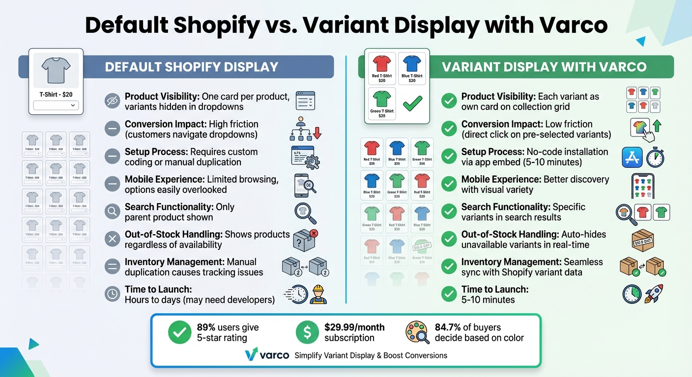
Default Shopify vs Variant Display Comparison
The table below compares Shopify's default product display setup with the enhanced variant display offered by Varco. It highlights key differences in visibility, ease of use, and overall impact on conversions.
| Feature | Default Shopify Display | Variant Display with Varco |
|---|---|---|
| Product Visibility | Displays one card per product, hiding variants until customers click to view options. | Displays each variant as its own product card directly on the collection grid. |
| Conversion Impact | High friction - customers must navigate dropdowns to explore options. | Low friction - shoppers can click directly on pre-selected variants. |
| Setup Process | Requires custom Liquid/JavaScript coding or manually duplicating products. | Simple no-code installation via app embed, completed in 5–10 minutes. |
| Mobile Experience | Limited browsing; customers may overlook available options. | Offers better discovery with visual variety and infinite scroll support. |
| Search Functionality | Only shows the main parent product in search results. | Displays specific variants directly in search results. |
| Out-of-Stock Handling | Products are shown regardless of variant availability. | Automatically hides out-of-stock variants in real time. |
| Inventory Management | Manual duplication can lead to inventory tracking issues. | Syncs seamlessly with Shopify variant data, simplifying inventory management. |
| Time to Launch | Can take hours or days, especially if hiring developers. | Ready to launch in just 5–10 minutes. |
Varco stands out by making variant management much easier and more efficient. Instead of dealing with custom coding or duplicating products manually, Varco offers a quick, no-code solution that works seamlessly with Shopify. Your inventory stays synced automatically, saving time and reducing errors.
Better visibility translates to better conversions. By reducing the number of clicks required to browse and select variants, Varco creates a smoother shopping experience - especially for mobile users, where extra steps often lead to abandoned carts. With 89% of users giving it a 5-star rating, Varco's $29.99 monthly subscription is a small price to pay compared to the costs of custom development or lost sales from poor product visibility.
Conclusion
Showing product variants on collection pages isn’t just about aesthetics - it’s a smart move that can boost sales and improve the shopping experience. By presenting all available colors, styles, and options upfront, you remove the uncertainty that often causes potential customers to leave. Considering that 84.7% of buyers make their decisions based on color, having these options clearly displayed helps ensure you’re not missing out on sales opportunities.
The advantages are undeniable: better product visibility, increased conversion rates, smoother mobile browsing, stronger SEO, and greater control over how your products are presented. Together, these benefits create a seamless shopping journey that keeps customers engaged and leads them to checkout faster.
For Shopify store owners, adding this feature doesn’t have to be complicated or costly. Tools like Varco make it easy to set up in just 5–10 minutes without any coding. Starting at just $9.99 per month, it’s a small price to pay compared to the revenue lost from poor product visibility.
The bottom line? Shoppers can’t buy what they can’t see. For industries like fashion, home decor, or beauty - where visual appeal is key - displaying variants as individual tiles on collection pages gives each option the spotlight it deserves, creating a catalog that works harder for you and a shopping experience that feels effortless.
FAQs
Will showing variants clutter my collection pages?
Displaying product variants on collection pages can be tricky, but it doesn’t have to result in a cluttered mess. By using apps that treat each variant as a separate product, you can keep your collection pages organized and visually appealing. This method not only increases product visibility but also creates a smoother, more enjoyable shopping experience for your customers.
How does variant splitting affect SEO and duplicate content?
Splitting product variants on collection pages can boost visibility and improve the shopping experience for customers. However, it also comes with potential SEO pitfalls, like duplicate content. To address this, Shopify uses canonical tags to guide search engines toward the main product page, helping to avoid penalties.
When creating split variant pages, it's essential to make each page stand out. This means adding unique content and crafting optimized metadata for each one. These steps can improve discoverability while keeping duplicate content issues at bay. Managing SEO effectively is crucial to enjoy the benefits of splitting variants without running into unnecessary risks.
Should I show sizes as tiles, or only colors/styles?
Displaying sizes as tiles helps create a cleaner, more organized look, making it simpler for customers to choose the size they need. In the same way, presenting colors or styles as individual tiles improves how products are showcased and streamlines the selection process. If your products rely heavily on factors like size, color, or style, using tiles for these options can make browsing more intuitive and enhance the shopping experience.