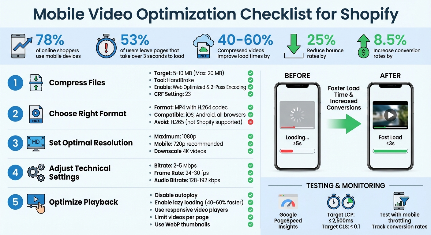
Want faster-loading Shopify pages and higher sales? Optimizing your product videos for mobile is the key. With 78% of online shoppers using mobile devices, slow-loading videos can cost you customers and revenue. Here's what you need to know:
- 53% of users leave pages that take over 3 seconds to load.
- Compressed videos can improve page load times by 40–60% and reduce bounce rates by 25%.
- Properly optimized videos increase conversion rates by 8.5%.
Key Tips for Mobile Video Optimization:
- Compress Files: Keep video sizes between 5–10 MB using tools like HandBrake.
- Use MP4 (H.264): This format ensures compatibility across devices and browsers.
- Set Resolution at 1080p (or lower): Downscale 4K videos for smaller file sizes.
- Optimize Playback: Disable autoplay, enable lazy loading, and use responsive video players.
- Test Performance: Use tools like Google PageSpeed Insights to monitor load times and fix issues.
Mobile Video Optimization Checklist for Shopify Stores
How to Make A Shopify Store Mobile Friendly | Shopify Mobile Optimization

Preparing Video Files for Optimization
Before uploading videos to your Shopify store, it’s essential to optimize them for mobile users. Raw footage is often too large and unsuitable for the web, which can lead to slow page load times and poor playback. The goal? Shrink the file size while keeping the video quality intact, ensuring smooth playback and faster loading for mobile shoppers.
Compressing Video Files
Compressing video files reduces their size by removing unnecessary data. While Shopify supports files up to 20 MB, keeping your videos between 5 MB and 10 MB is ideal for mobile performance. Larger files can slow down your page, frustrating users.
A reliable tool for this is HandBrake, which is free and user-friendly. When using HandBrake, select the Web Optimized option. This ensures metadata is moved to the start of the file, allowing the video to begin playing before the entire file is downloaded. For better quality, you can enable 2-Pass Encoding, though it will take longer to process. A Constant Rate Factor (CRF) setting of 23, the standard default for H.264, strikes a good balance between file size and quality.
In early 2024, the apparel brand True Classic revamped their video assets across over 700 product pages. By compressing files and adopting adaptive bitrate streaming, they achieved faster page loads and eliminated buffering issues.
Selecting the Right Format and Resolution
Choosing the right video format is crucial for compatibility and performance. MP4 with the H.264 codec is the most widely supported format for Shopify. It works seamlessly across browsers and on both iOS and Android devices. While H.265 (HEVC) offers better compression - reducing file sizes by up to 50% compared to H.264 - it isn’t currently supported by Shopify.
"MP4 is the best video format for the web, in most cases. It works smoothly across most web browsers, plays well on smartphones and other mobile devices, and matches higher video quality with lower file sizes."
– Rob LeFebvre, Shopify
Keep your resolution at 1080p or lower. If your video was originally recorded in 4K, downscale it to 1080p - or even 720p - to significantly reduce the file size without losing noticeable quality on mobile screens.
Adjusting Bitrate and Frame Rate
To further optimize your videos, fine-tune the bitrate and frame rate. For 1080p videos, aim for a bitrate of 2–5 Mbps, a frame rate of 24–30 fps, and an audio bitrate of 128–192 kbps. These settings strike a balance between smooth playback and manageable file sizes for mobile users.
| Specification | Recommended Setting | Impact |
|---|---|---|
| File Size | 5–10 MB (Max: 20 MB) | Faster page load times |
| Resolution | 1080p maximum | Best balance of clarity and file size |
| Format | MP4 with H.264 codec | Ensures compatibility across devices |
| Bitrate | 2–5 Mbps | Maintains video quality with smaller sizes |
| Frame Rate | 24–30 fps | Smooth playback with reduced file size |
| Audio Bitrate | 128–192 kbps | Clear audio without excessive file size |
Uploading Videos with Optimal Settings
Once you've optimized your video files, the next step is to upload them using settings that enhance mobile performance. These configurations can significantly improve how quickly your videos load and play on mobile devices.
Disabling Autoplay and Enabling Lazy Loading
Turning off autoplay is one of the simplest ways to speed up your mobile pages. When videos autoplay, they start downloading immediately, which can delay other content from loading. This not only impacts your Largest Contentful Paint (LCP) score but can also frustrate visitors before they even get a chance to explore your product.
Instead, enable lazy loading to delay video downloads until they're actually needed. With lazy loading, videos only start downloading when they appear in the user's viewport, reducing initial load times by 40–60%. For example, in February 2024, True Classic implemented lazy-loaded video widgets on over 700 product pages using a lightweight 37kb script. This allowed videos to load instantly as users scrolled to them, maintaining excellent page speeds.
"A mobile user is more likely to engage with your content, interact with features, and explore your site further when they don't have to wait for pages to load."
– Rich Moy, Shopify
If autoplay is necessary, keep video files under 10 MB and mute the audio to avoid creating an intrusive experience. With 79% of Shopify store traffic coming from mobile devices, every second of load time matters.
Optimizing Thumbnails
Once autoplay and lazy loading are configured, focus on ensuring your thumbnails load quickly and look sharp. Optimized thumbnails are especially important if autoplay is disabled or delayed, as they create the first impression. Custom thumbnails outperform auto-generated ones because they allow you to control the messaging and branding. Use compressed formats like WebP to keep file sizes small while maintaining high visual quality.
When designing thumbnails, prioritize mobile-friendly elements. Incorporate faces, bold text overlays, and brand colors to make them visually engaging and improve click-through rates. Additionally, stick to mobile-friendly aspect ratios like vertical (9:16) or square (1:1), which work best on product pages and mobile feeds. A well-crafted thumbnail not only acts as a placeholder but also encourages users to click, especially when lazy loading is in use.
Limiting Videos per Product Page
To maintain fast load times, avoid overloading product pages with too many videos. Multiple videos can slow down the page and overwhelm shoppers with too much content. Instead, focus on including only the most essential videos above the fold. Secondary content, such as lifestyle shots or testimonials, can be placed in collapsible accordions or carousels.
A great example of this approach is Vital Proteins' "Matcha Collagen" product page. In August 2025, they prioritized key elements - like the price, call-to-action, and hero image - above the fold. Secondary information, such as nutrition facts and lifestyle videos, was neatly organized into a carousel and collapsible sections. This streamlined design reduced clutter, sped up load times, and made it easier for shoppers to find what they needed without unnecessary scrolling.
Mobile-Specific Performance Tweaks
Once your video files and upload settings are optimized, it's time to focus on mobile-specific adjustments. These tweaks ensure videos adapt seamlessly to different screen sizes, load efficiently on slower networks, and maintain a stable viewing experience. One key step is using responsive video players to enhance playback across devices.
Using Responsive Video Players
Responsive video players are designed to adjust to various screen sizes and orientations. They also incorporate adaptive bitrate streaming, which dynamically modifies video quality based on the viewer's connection speed. This reduces buffering, especially on slower networks. Considering that 58% of users browse ecommerce sites on mobile and 91% expect high-quality video experiences, these features aren't just nice to have - they're essential. Additionally, integrating mobile-friendly controls can make videos easier to navigate.
Testing with Mobile Throttling
To ensure videos perform well in real-world conditions, test them under simulated mobile environments using Chrome DevTools. Profiles like "Slow 3G" or "Fast 3G" can help you identify potential issues. As Shreelekha Singh, Content Writer for Videowise, highlights:
"You can check how the video loads on different screens at varying internet speeds."
These tests can uncover slow-loading scripts or assets that interfere with playback. Beyond simulations, test on actual mobile devices to get a clearer picture. Tools like Google PageSpeed Insights and WebPageTest can provide valuable data on performance metrics, helping you fine-tune further.
Preventing Layout Shifts (CLS)
Unexpected layout shifts can distract and frustrate mobile users, especially shoppers. To avoid this, reserve space for videos by defining an aspect ratio or fixed dimensions in your CSS. The poster attribute can display a placeholder image while the video loads, improving the visual experience. Use Chrome DevTools to monitor and address layout shifts, ensuring a stable interface. These adjustments can lead to measurable improvements, such as reducing bounce rates by 25% and increasing conversion rates by 8.5%.
sbb-itb-d9e5b3a
Monitoring and Measuring Performance
Keeping an eye on performance is essential to confirm faster load times and increased sales. These metrics pave the way for actionable insights, as outlined below.
Evaluating Load Times with Google PageSpeed Insights
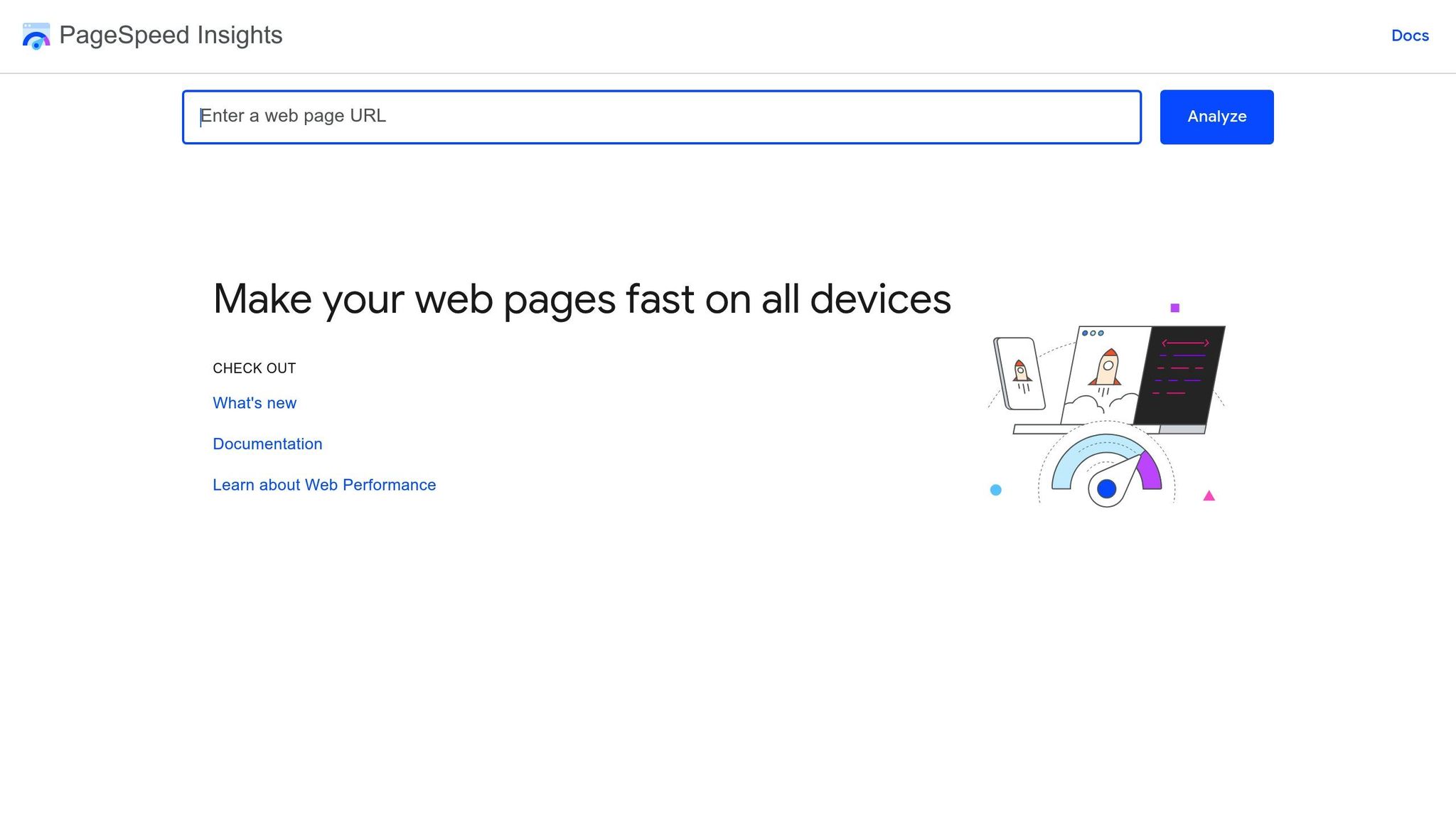
Google PageSpeed Insights is a powerful tool for assessing the performance of Shopify product pages. By focusing on the "Mobile" tab, you can account for mobile-specific factors like bandwidth and processing limitations. One of the key metrics it highlights is Largest Contentful Paint (LCP), which measures how quickly the largest visible element - often a product video - appears to users.
As Videowise explains:
"Optimized videos should load within 2-3 seconds and not significantly impact your overall page speed score"
The tool also pinpoints performance bottlenecks in the "Opportunities" and "Diagnostics" sections. These might include slow-loading scripts or unoptimized video files that negatively affect your LCP score.
| Core Web Vital | Good | Moderate | Poor |
|---|---|---|---|
| Largest Contentful Paint (LCP) | ≤ 2,500ms | 2,500ms - 4,000ms | > 4,000ms |
| Cumulative Layout Shift (CLS) | ≤ 0.1 | 0.1 - 0.25 | ≥ 0.25 |
Testing across various mobile devices is crucial to ensure accurate results. Additionally, metrics like Time to First Byte (TTFB) and First Contentful Paint (FCP) can help determine whether delays stem from server issues or large asset sizes.
Tracking Conversion and Engagement Metrics
Performance isn't just about load times - it’s also about how users interact with your content. To measure video effectiveness, monitor its impact on sales and engagement. Shopify’s built-in analytics dashboard is a great place to track key metrics such as conversion rate, bounce rate, and time on site for pages featuring optimized videos. Properly optimized videos can lead to higher conversions and lower bounce rates.
Dive deeper by analyzing video completion rates and viewer retention to uncover areas for improvement. For pages with video widgets, track clicks on tagged products and social interactions like likes and comments. Another valuable metric is the Cost Per Acquisition (CPA) - compare CPA for video-heavy pages against non-video pages after collecting 3-7 days of data. This helps you make informed adjustments based on both technical and behavioral insights. Together, these data points fuel ongoing improvements.
Using Shopify Apps for Video Optimization
When it comes to improving mobile performance, certain Shopify apps can make video delivery smoother and more efficient. These apps handle the heavy lifting of video optimization, preventing large files from bogging down your store's speed.
Integrating UWidget for Lightweight Video Embedding
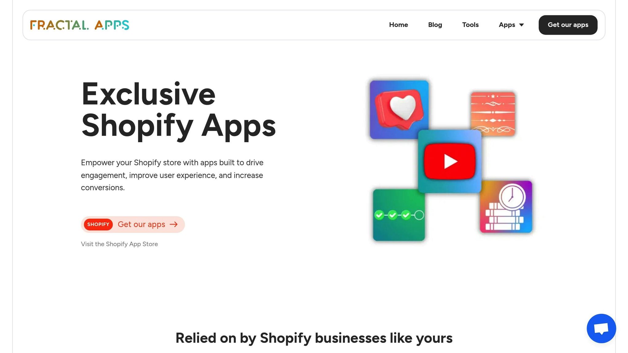
One standout option is UWidget, which uses a clever thumbnail-first approach. Instead of immediately loading the full video player, it begins with a lightweight image. The actual video player only activates when the user clicks on it. This technique minimizes initial page weight, a game-changer for mobile users on slower connections. Plus, it supports YouTube Shorts and vertical videos - formats that grab 40% more attention on mobile compared to traditional landscape videos.
UWidget offers three pricing tiers:
- Starter: $5.99/month (1 widget, 25 videos)
- Pro: $13.99/month (3 widgets, 50 videos)
- Premium: $19.99/month (unlimited videos)
Each plan comes with a 7-day free trial.
What sets UWidget apart is its lazy loading feature, which ensures the full video player only loads when users interact with it. This not only saves data but also helps maintain strong Core Web Vitals scores. With YouTube handling the video streaming, your store's server avoids extra strain - especially important since 73% of consumers prefer short videos over text.
UWidget has earned a perfect 5.0/5 rating on the Shopify App Store, with users praising its seamless integration and reliable performance. It's a simple yet effective way to keep your store fast while delivering engaging video content.
Conclusion and Key Takeaways
Improving mobile video performance for your Shopify store is all about removing obstacles in the shopping journey. By compressing videos to under 10 MB, using MP4 (H.264) format, and keeping resolutions to 1080p (or 720p for mobile), you can speed up load times by 40–60% and reduce bounce rates by up to 25%.
On top of file optimization, fine-tune your video settings for smoother playback on mobile devices. Turn off autoplay, enable lazy loading, and stick to vertical (9:16) videos to grab attention - this format can increase viewer engagement by 40%. Plus, with 64% of shoppers being more likely to buy after watching a product video, these adjustments can directly impact your sales.
For an even better user experience, focus on mobile-specific tweaks. Use responsive video players and test for mobile throttling to address potential issues before they affect customers. Tools like Google PageSpeed Insights and conversion tracking can help you measure the impact of these changes. As Carl Weische, a CRO Specialist, explains:
"Optimizing videos helps load pages quickly and improves conversion rates"
Finally, consider using tools like UWidget to simplify video embedding and improve mobile performance. With 85% of consumers more likely to make a purchase after watching a video, focusing on elements like video length (21–34 seconds) and captions for silent viewing can create a seamless mobile experience that turns visitors into customers.
FAQs
How can I make sure my Shopify product videos load quickly on mobile devices?
To make sure your Shopify product videos load quickly on mobile devices, start by compressing them before uploading. Using modern codecs like H.264 or H.265 can help reduce file sizes without sacrificing quality. Opt for mobile-friendly resolutions - 1080×1920 for vertical videos or 1920×1080 for landscape. If you’re targeting users with slower internet connections, consider scaling down to 720p for even faster loading.
Choose web-optimized formats like MP4 and enable lazy loading, which delays video downloads until they’re actually needed on the screen. Hosting your videos on Shopify’s CDN or another fast CDN with U.S.-based servers can further enhance loading speeds. For a hassle-free solution, apps like UWidget by Fractal Apps can automatically optimize video embeds, ensuring smooth performance on mobile devices.
What is the best video format and resolution for Shopify product pages?
When it comes to Shopify product pages, the MP4 format paired with the H.264 codec is your best bet. For resolution, stick to 1080p (1920 × 1080 pixels). This setup ensures crisp visuals, smooth playback, and quick loading on both desktops and mobile devices, creating a seamless shopping experience for your customers.
What is lazy loading, and how does it enhance mobile video performance on Shopify?
Lazy loading postpones the loading of a video until it's actually needed - like when a user scrolls to it or presses play. This approach cuts down the page's initial load time, helping your Shopify store feel quicker and more responsive, especially for mobile users. Plus, it can enhance Core Web Vitals, offering a smoother browsing experience and potentially boosting your search engine rankings.