Mobile shoppers are impatient, and 53% of them leave sites that take over 3 seconds to load. If you aren't creating compelling video content optimized for mobile, you're likely losing customers. Here's what you need to know:
- Video Optimization: Use MP4 (H.264), keep resolution at 1080p, and file sizes under 10MB for faster loading.
- Mobile-Friendly Themes: Choose Shopify themes like Dawn or Motion, which support lazy loading and autoplay features.
- Widget Placement: Position videos near product images or below the homepage fold to increase engagement. This is a key part of broader video marketing strategies for growth.
- Lazy Loading: Load videos only when visible to improve page speed.
- Testing: Use tools like Google Lighthouse and PageSpeed Insights to measure performance and tweak settings.
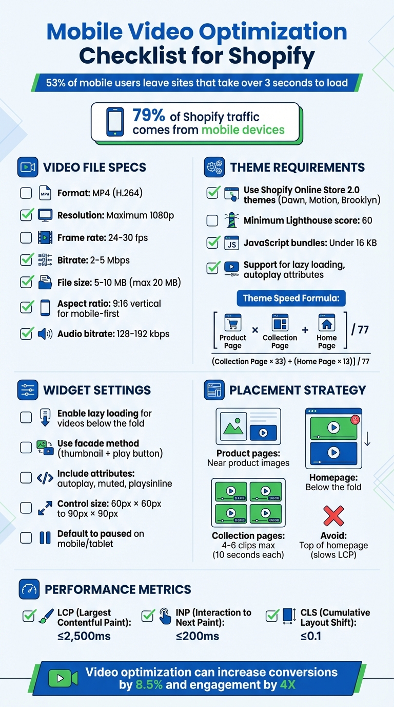
Mobile Video Optimization Checklist for Shopify Stores
How To Improve Shopify Mobile Speed (Simple Steps)

Integrating YouTube with Shopify can further enhance your store's performance and engagement.
sbb-itb-d9e5b3a
Choosing Mobile-Friendly Shopify Themes
To ensure your videos perform well on mobile, start with a theme specifically designed for mobile use.
With 79% of Shopify traffic and 69% of orders coming from mobile devices, using exclusive Shopify apps and selecting a theme optimized for mobile is a no-brainer.
Focus on themes built with Shopify's Online Store 2.0 architecture, such as Dawn, Motion, or Brooklyn. These themes let you customize mobile layouts separately from desktop designs, giving you more control over how videos appear on smaller screens. Among these, Dawn stands out as Shopify’s standard for mobile-first design and consistently performs well in speed and usability tests.
Look for themes that support native lazy loading and keep JavaScript bundles under 16 KB to ensure videos load quickly. Also, check that the theme supports mobile autoplay attributes like muted, playsinline, and loop to prevent videos from automatically playing in full-screen mode on iOS devices.
Responsive Design Requirements
A good responsive theme adapts video containers to fit any screen size without breaking your page layout or causing horizontal scrolling. The theme's CSS should manage flexible aspect ratios and include touch-friendly controls, ensuring buttons and icons are spaced far enough apart to avoid accidental taps.
Shopify mandates that themes in its official store maintain a minimum Lighthouse performance score of 60 for home, product, and collection pages. This ensures your theme won’t slow down video playback. Themes that use system fonts instead of custom web fonts conserve bandwidth for video data, and those integrated with Shopify’s content delivery network (CDN) speed up asset delivery using HTTP/2 prioritization.
Testing Themes on Mobile Devices
Before finalizing your theme choice, test it thoroughly on mobile. Use Google Lighthouse for mobile performance analysis. Generate a "Share Preview" link from your Shopify admin and paste it into PageSpeed Insights to get detailed feedback on mobile speed and usability. Shopify calculates theme speed using this formula:
[(Product Page × 31) + (Collection Page × 33) + (Home Page × 13)] / 77.
Test your theme on real devices in both portrait and landscape orientations to ensure videos scale properly. Temporarily disable JavaScript to check basic navigation functionality. Tools like BrowserStack can help you simulate how videos render on older mobile browsers and operating systems, allowing you to catch compatibility issues before they affect customers.
Starting with the right theme is a critical step in optimizing video performance for mobile users.
Preparing Video Files for Mobile
Optimizing video files is just as important as picking the right mobile-friendly themes. Why? Because large videos can slow down your site, frustrating users and driving them away. If you want fast, high-quality performance on mobile, getting your video specs right is a must.
The best format to use? MP4 (H.264). This format offers a great balance between quality and file size and works seamlessly across all mobile browsers and devices. As Rob LeFebvre from Shopify puts it:
"MP4 is the best video format for the web, in most cases. It works smoothly across most web browsers, plays well on smartphones and other mobile devices, and matches higher video quality with lower file sizes."
Here’s how to ensure your videos are mobile-ready.
Video File Specifications
To keep your videos efficient and sharp on mobile:
- Stick to a maximum resolution of 1080p with 24–30 fps.
- Aim for a bitrate of 2–5 Mbps and a file size between 5–10 MB. While Shopify allows videos up to 20 MB, smaller files load much faster, especially on cellular networks.
- For mobile-first experiences, consider using a 9:16 vertical aspect ratio (1080x1920 pixels). Vertical videos fill the entire screen, creating a more immersive viewing experience without those annoying black bars.
- Keep the audio bitrate between 128–192 kbps. This ensures clear sound while keeping the file size manageable.
Avoid overkill with 4K resolution - it adds unnecessary bulk without improving the experience on small screens.
Video Compression Tools
Once your video specs are set, compressing the files further is key to faster load times.
- Handbrake: A free, open-source tool that gives you full control over compression. Simply upload your video, select MP4 (H.264), and adjust the bitrate to hit your target file size. If your video takes more than 2.5 seconds to load in Shopify's preview, lower the bitrate to around 5,000 kbps and recompress it.
- CloudConvert and Clipchamp: These cloud-based tools are perfect for quick results. They come with preset optimization settings that balance quality and compression automatically, making them ideal for processing multiple videos.
A great example of efficiency? In February 2024, True Classic, an apparel brand, optimized over 700 product pages by using compressed video assets. They combined asynchronous scripts of just 37 KB with adaptive bitrate streaming to deliver high-quality visuals while maintaining fast load times on mobile connections.
Finally, trim unnecessary seconds from your videos. Cutting out 3–5 seconds of silent openings or endings can reduce the file size by several megabytes without affecting the core content. Small edits like this can make a big difference.
Adjusting Video Widget Settings for Mobile
Once you’ve optimized your video files and chosen mobile-friendly themes, it’s time to fine-tune your widget settings for better playback on mobile devices. These tweaks can greatly influence load times, user experience, and how videos perform on smaller screens.
Setting Up Lazy Loading and Autoplay
Lazy loading is a smart way to speed up mobile pages by only loading videos as they come into view. If you’re using Shopify’s Rich Theme Editor, you can enable lazy loading automatically with a simple Liquid filter. Add the following code to your theme templates:
{{ article.content | replace: '<iframe ', '<iframe loading="lazy"' }}
This ensures all video iframes load lazily by default.
Another effective approach is the facade method. Instead of loading the full video upfront, display a lightweight thumbnail with a play button. The actual video only loads when the user taps play. This method is especially useful for hero sections or product carousels, as it reduces the initial load size.
"A simple way of lazy loading YouTube videos, or any iframe embedded content, with just a single line of code. Chrome 76 comes with a native image and iframe lazy-loading." – Sections.design
However, avoid lazy loading videos placed above the fold. Delaying these can negatively impact the Largest Contentful Paint (LCP), which in turn can hurt your SEO performance.
For autoplay on mobile, keep in mind that browsers like Safari and Chrome block videos from autoplaying unless they are muted and include the playsinline attribute. If autoplay is essential for background or ambient videos, make sure your widget code includes the autoplay, muted, and playsinline attributes together.
Configuring Aspect Ratios and Controls
Mobile users rely on touch interactions, so video controls must be easy to use. Play buttons should be between 60px × 60px and 90px × 90px for clear visibility. Position controls at the bottom of the video with minimal or no padding to create a consistent experience. Stick to standard rounded or angular icons to ensure users instantly recognize interactive elements.
For the best viewing experience, vertical videos with a 9:16 aspect ratio are ideal for mobile screens, as they avoid black bars and fill the display naturally. Use device-specific settings to serve videos with the right aspect ratio, preventing awkward cropping on smaller screens. Additionally, set videos to default to paused on mobile and tablet devices. This prevents overwhelming users, particularly those on slower connections.
"Video content should default to paused on page load as it can be unexpected, overwhelming, and distracting when defaulted to playing." – Shopify
Testing Widget Settings on Mobile
Once you’ve made these adjustments, test your settings on actual devices. While tools like Chrome DevTools are helpful for previewing different screen sizes, they don’t always replicate real-world mobile behaviors, especially for autoplay and inline playback.
Start by verifying that your code includes the muted and playsinline attributes. These are essential for ensuring smooth autoplay and preventing iOS from forcing videos into full-screen mode.
Check that videos load within 2–3 seconds under various network conditions. Use tools like Google PageSpeed Insights to confirm that your video widget isn’t negatively affecting Core Web Vitals.
In February 2024, True Classic - a popular apparel brand - successfully optimized over 700 product pages by implementing asynchronous scripts of just 37 KB and adaptive bitrate streaming. This allowed them to deliver high-quality video content even on slow mobile connections.
Finally, review your analytics to see whether your audience primarily uses iOS or Android. Test your videos on the corresponding native browsers (Safari for iOS and Chrome for Android) to ensure the best performance.
Using UWidget for Mobile Video Features
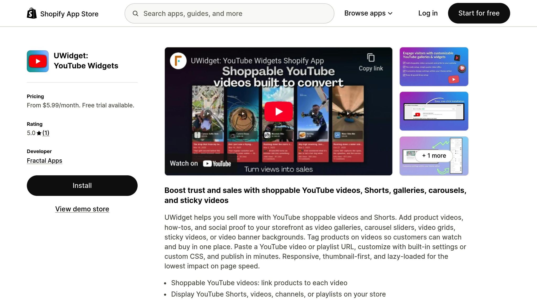
UWidget is designed to optimize YouTube video playback for mobile users on Shopify. By loading videos through a thumbnail-first method, this app ensures faster mobile page load times without compromising visual quality. It works effortlessly with existing mobile optimizations, boosting page speed and keeping visitors engaged. This integration complements earlier theme and widget tweaks, making sure your YouTube videos perform smoothly on mobile screens.
Installing and Setting Up UWidget
Getting started with UWidget is straightforward. Simply search for "UWidget: Youtube Widgets" in the Shopify App Store, add the app to your store, and confirm installation by entering your store URL. After that, paste your YouTube video or playlist URL, adjust the appearance using the app's built-in settings or custom CSS, and publish your widget.
UWidget offers a 7-day free trial, with paid plans starting at $5.99/month (Starter: 1 widget, 25 videos), $13.99/month (Pro: 3 widgets, 50 videos), and $19.99/month (Premium: unlimited widgets and videos). All plans include a shoppable video feature, allowing you to tag products directly within videos. This makes it easy for customers to watch and shop in a single, seamless experience. Once set up, UWidget’s mobile-friendly features help drive even greater engagement.
Mobile-Specific UWidget Features
After installation, take advantage of UWidget’s mobile-focused layouts. The app’s responsive designs adapt perfectly to smaller screens, offering video galleries, carousel sliders, and video grids. The sticky video player ensures product demos remain visible as users scroll through your store.
UWidget also supports vertical 9:16 videos, which naturally fit mobile screens and capture 40% more attention than landscape formats. You can further customize the mobile experience by adjusting spacing and font sizes for different screen breakpoints using custom CSS. These features make it easier to create a polished, engaging mobile shopping experience.
Positioning Video Widgets on Mobile Pages
After fine-tuning your theme and optimizing files, the next step to boosting mobile engagement is smart widget placement. Where you position video widgets can directly impact interaction rates, with strategic placement increasing engagement by more than 50%.
Widget Placement Guidelines
For product pages, position videos close to images to showcase demos, 360° views, or testimonials. Research shows that videos significantly influence buying decisions. For instance, jewelry brand Winterson discovered that customers who watched video reviews were 120.5% more likely to purchase, spent 157.2% longer browsing, and increased their order value by 9.1%.
On the homepage, videos work best just below the fold rather than at the very top. This ensures quick page loading while still grabbing attention early. For collection pages, videos can highlight category overviews or offer styling tips. However, keep it concise - limit yourself to 4–6 short clips (around 10 seconds each) to maintain page speed.
Floating widgets are another great option. They keep key content, like reviews or demos, visible as users scroll. Carousel formats are especially effective for showcasing product collections or user-generated content.
Common Placement Mistakes to Avoid
While strategic placement is important, knowing what to avoid is just as crucial.
Don’t place videos at the very top of your homepage. This can slow down the initial load time, leading to higher bounce rates and negatively affecting search rankings.
Don’t overload a page with too many videos. Excessive content can overwhelm users and hurt mobile performance. Stick to the 4–6 video limit, and use lazy loading to ensure videos load only when users scroll to them. Lastly, make sure layouts are touch-friendly with enough spacing for effortless tapping on mobile screens.
Measuring Mobile Widget Performance
Keeping an eye on your live video widget's performance is key to ensuring smooth engagement and spotting any slowdowns.
Analytics Tools for Mobile Performance
To get started, check out Shopify's Web Performance Dashboard in your admin panel. This handy tool focuses on Core Web Vitals - Google's key metrics for evaluating user experience. By filtering the data specifically for mobile, you can access visitor-based Core Web Vitals ratings.
Here are the three Core Web Vitals you should monitor:
- Largest Contentful Paint (LCP): This measures how quickly your video thumbnail or player appears. Aim for a load time of 2,500 milliseconds or less.
- Interaction to Next Paint (INP): Tracks delays when users tap "Play." Keep this under 200 milliseconds for a seamless experience.
- Cumulative Layout Shift (CLS): Detects if your video widget causes content to shift while loading. A score under 0.1 is ideal.
You can also use Google PageSpeed Insights for page-specific audits. This tool helps pinpoint whether your video widgets are slowing down rendering. Run tests on your product pages to uncover areas where optimizing elements like video scripts could save time. Additionally, WebPageTest lets you simulate performance on slower networks, like 3G or 4G, ensuring your videos load smoothly for all users.
Once you've gathered insights from these tools, adjust your widget settings to boost engagement and performance.
A/B Testing Widget Configurations
A/B testing is a powerful way to fine-tune your widget setup. The key is to change one variable at a time - such as autoplay versus manual play or experimenting with different thumbnail designs.
Run each test for 14 days or until you achieve 95% statistical significance, which usually requires about 1,000 conversions per variation. For example, test whether autoplay increases engagement without slowing down load times, or if adding captions leads to longer watch times for users viewing without sound. Keep track of metrics like play rate, completion rate, click-through rate, and LCP to measure the impact of your changes.
"A good A/B test starts with a theory about how to improve performance... state it in the form 'I believe (making X change) will lead to improved (performance in Y metric).'" - Shopify Staff
Conclusion
Fine-tuning mobile video widgets can significantly improve both conversions and revenue. With mobile commerce expected to make up 59% of all retail e-commerce sales by 2025, having an effective video strategy is more important than ever. By focusing on technical optimizations, you can ensure that mobile users enjoy fast, high-quality video playback.
To recap some of the key strategies: stick with MP4 (H.264) format, keep file sizes between 5–10MB, and limit resolution to 1080p. These adjustments strike a balance between quality and speed, leading to 40–60% faster loading times and up to an 8.5% increase in conversions on product pages. Additionally, configuring widgets with muted and playsinline attributes allows videos to autoplay on mobile without requiring any user interaction - an essential feature for seamless browsing.
Another valuable technique is lazy loading, which ensures videos load only when they’re visible on the screen. This reduces initial page load times and helps prevent visitors from bouncing due to slow performance. Pairing lazy loading with responsive design creates a smooth shopping experience, leading to as much as 4X longer visitor engagement.
As highlighted earlier, ongoing testing and monitoring are crucial for maintaining mobile performance. Tools like Google PageSpeed Insights can help you track video widget performance, while A/B testing different configurations offers insights into what resonates best with your audience.
When you combine optimized file formats, thoughtful widget settings, strategic placement, and regular performance checks, you’re not just improving page load times - you’re setting the stage for higher conversion rates and a better shopping experience for your mobile customers.
FAQs
How can I make sure my Shopify video widgets perform well on mobile devices?
To ensure your Shopify video widgets perform well on mobile devices, focus on quick loading and smooth display. Here's how:
- Include a viewport meta tag: This ensures your interface scales correctly for mobile screens, offering a better viewing experience.
- Minimize script delays by using the
deferorasyncattributes in your script tags. This tweak helps speed up page load times.
These simple changes can greatly improve both performance and the overall user experience for mobile users.
How can I position video widgets on Shopify mobile pages for the best results?
To make the most of video widgets on Shopify mobile pages, place them strategically near key areas like product pages or next to product images. These spots are prime real estate for videos that can influence purchasing decisions by showcasing products in an engaging and informative way.
When it comes to homepage or collection pages, it’s a good idea to position videos below the fold. This keeps the layout clean while still drawing user interest as they scroll. Opt for vertical video formats (9:16) to better suit mobile screens and grab attention. To ensure smooth performance, optimize videos for quick loading by using techniques like compression and lazy loading. If you enable autoplay, make sure the videos play muted - this aligns with mobile browser norms and keeps the browsing experience smooth and uninterrupted.
By carefully choosing where and how you use video widgets, you can boost user engagement without compromising the seamless flow of the mobile experience.
What are the best video file specifications for mobile optimization on Shopify?
When preparing Shopify videos for mobile, stick to the MP4 format. This format provides high-quality visuals, keeps file sizes manageable, and works smoothly across most devices and browsers.
To ensure smooth playback, opt for a resolution of 720p or lower. This strikes a good balance between video clarity and quick loading speeds. Also, try to keep file sizes under 5 MB to make sure mobile users experience minimal delays.