Your Shopify video thumbnail is the first thing viewers see, and it can determine whether they click or scroll past. A well-designed thumbnail grabs attention, builds trust, and boosts engagement. Here's what you need to know:
- Use the right size and resolution: 1280 x 720 pixels, 16:9 aspect ratio, and keep file sizes under 2 MB for fast loading.
- Choose the best frame: Highlight key moments or human interaction to create an emotional connection.
- Design essentials: Use bold, readable text, contrasting colors, and simple layouts to ensure clarity on mobile devices.
- Stay consistent: Incorporate your brand’s colors, fonts, and logos across all thumbnails for easy recognition.
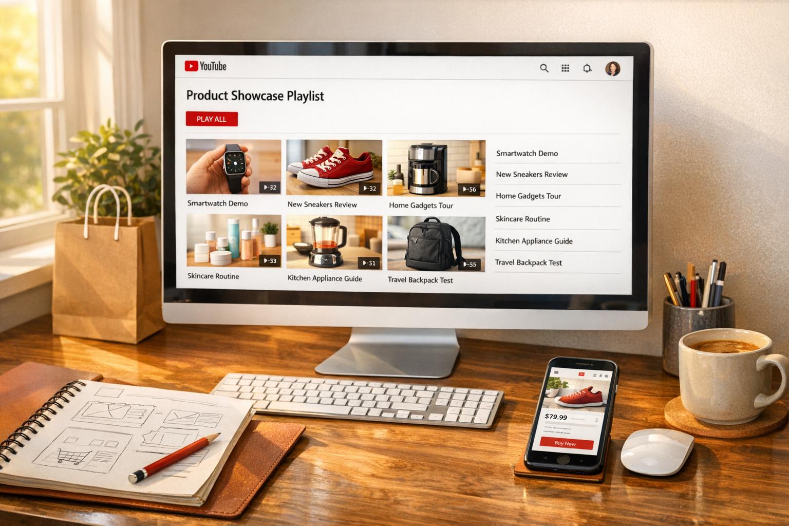
- Test and optimize: Preview thumbnails on mobile and track performance by integrating YouTube with Shopify and using analytics or tools like UWidget.
A strong thumbnail design can increase clicks and drive conversions. Focus on simplicity, accuracy, and branding to stand out from the competition.
Shopify Video Thumbnail Requirements
Shopify Video Thumbnail Technical Requirements and Best Practices
To ensure your video thumbnails look great across devices and load quickly, it's essential to follow Shopify's technical guidelines. Here’s a breakdown of the key requirements for optimal Shopify video thumbnails.
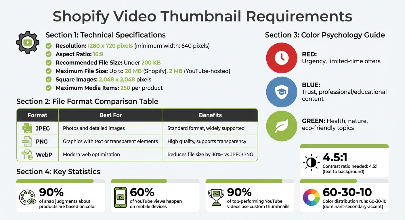
Thumbnail Dimensions and Resolution
Shopify recommends using a resolution of 1280 x 720 pixels (with a minimum width of 640 pixels) and maintaining a 16:9 aspect ratio. These specifications help avoid cropping issues and ensure your thumbnails remain sharp and clear across different screen sizes.
For the best results, always opt for high-resolution images. This allows your thumbnails to scale properly without losing quality.
File Format and Size Limitations
Shopify supports several file formats for thumbnails, including JPEG, PNG, GIF, and BMP. To ensure fast loading times, keep your file size under 200 KB whenever possible. However, Shopify allows files up to 20 MB, and YouTube-hosted videos support thumbnails up to 2 MB.
Here’s a quick guide to choosing the right file format:
- JPEG: Ideal for photos and detailed images.
- PNG: Best for graphics with text or transparent elements.
- WebP: A modern format that reduces file size by over 30% compared to JPEG or PNG, without sacrificing quality.
By using the right format and optimizing file sizes, you can balance visual appeal with performance.
Branding and Visual Consistency
Your thumbnails should reflect your store’s identity by incorporating brand colors, fonts, and logos consistently. This approach not only reinforces your brand but also makes your content instantly recognizable.
A great example of this is the Shopify Masters YouTube series. As of June 2025, every thumbnail in the series features:
- A specific logo
- A unified color palette
- Consistent font styles
- A human element to increase engagement
"Aim to create a recognizable design style for your thumbnail designs so users can identify your videos by sight. Using consistent colors, fonts, and graphic elements supports brand recognition." - Shopify Staff
To simplify the process, consider creating a design template. By predefining your layout, font sizes, and graphic elements, you can maintain brand standards while streamlining your workflow. Once your template is set, applying it to new thumbnails becomes quick and efficient.
sbb-itb-d9e5b3a
Choosing the Best Frame for Your Thumbnail
When it comes to crafting a thumbnail, think of it as the digital version of a book cover. It’s what convinces viewers to click on your video - or scroll past it. According to Shopify's technical standards, selecting the right frame is crucial to effectively convey your video’s message and engage potential customers.
Your thumbnail should accurately reflect the content of your video. While a misleading image might generate clicks initially, it can harm your credibility and lead to higher bounce rates.
Identifying Key Moments in the Video
Start by reviewing your video for frames that clearly showcase product benefits or usage scenarios. Avoid frames that are too action-packed or visually chaotic - when reduced to thumbnail size, these can appear cluttered and fail to grab attention.
"When you shrink busy, action-packed images, they can appear cluttered to viewers in thumbnail form." - Shopify Staff
Instead, pick high-resolution frames where your product stands out against a clean background. It’s a good idea to preview your thumbnail on a smartphone to ensure it remains sharp and easy to understand at smaller sizes.
Look for moments in the video that highlight something unique - whether it’s a standout product feature, the end result of a project, or a dramatic moment that grabs attention. Always use full-size images to avoid pixelation issues.
Finally, consider frames that incorporate human interaction to make your thumbnail even more engaging.
Highlighting Products or Human Interaction
Thumbnails featuring human faces tend to perform better when it comes to click-through rates. People are naturally drawn to other people, and a friendly, recognizable face can establish trust before the video even starts.
"Seeing a face can build trust and create an emotional connection with viewers." - Shopify Staff
Choose frames that capture genuine emotion - like joy, surprise, or excitement - especially when someone is interacting with your product. These moments make your content feel relatable and inviting. If your video includes someone actively using the product, that kind of dynamic shot can be more compelling than a simple static product image, as it demonstrates the product’s benefits in action. This is a core component of effective video marketing strategies for e-commerce.
Keep the background simple and avoid cluttering the thumbnail with excessive text or graphics. The focus should remain on the person or the interaction, offering viewers a clear and enticing glimpse of what your video has to offer.
Designing Eye-Catching Thumbnails
Once you've picked the perfect frame, the next step is creating a thumbnail that demands attention. Colors play a huge role here - research shows that 90% of snap judgments about products are based on color alone.
Using Contrasting Colors and Bold Text
The right design elements can take your thumbnail from good to great. Start by using the color wheel to choose complementary colors, like blue and orange, that naturally catch the eye. For balance, apply the 60-30-10 rule: 60% for a dominant color, 30% for a secondary one, and 10% for accents like text or call-to-action buttons.
When it comes to text, boldness and legibility are key - especially since over 60% of YouTube views happen on mobile devices. Large, sans-serif fonts work best for clarity. To ensure readability, maintain a contrast ratio of at least 4.5:1 between text and background. Tools like WebAIM's Contrast Checker can help you nail this. If your background image is busy, use a solid color text box or overlay to make the text pop.
Color psychology can also guide your choices. For instance:
- Red conveys urgency, making it ideal for limited-time offers.
- Blue builds trust, perfect for professional or educational content.
- Green suggests health and nature, great for eco-friendly topics.
"Your accent colors act like a GPS system for your customers, directing their eyes to the most important elements on each page." - Cesar A. Beltran, Founder and CEO of Blackbelt Commerce
Adding Overlays and Call-to-Actions
Text overlays should complement your video title, not repeat it. Instead of generic phrases like "Buy Now", go for something specific and engaging, like "Take Better Photos." This approach gives viewers a clear reason to click while setting accurate expectations for your content.
Visual overlays, like labels ("DIY" or "Before/After"), can instantly communicate your video's value. Adding arrows or text boxes helps guide the viewer's attention to the most important elements. But keep these overlays simple - too much can overwhelm the design. These thoughtful touches create a polished look and help establish a consistent brand identity.
Maintaining Simplicity and Avoiding Clutter
A clean design is always more effective. Focus on a single subject, whether it's a person’s face or a product, and give it enough space to stand out.
Stick to short, punchy phrases in simple fonts, and use negative space strategically to make your message shine. This not only reduces distractions but also ensures the design looks sharp on smaller screens. Always preview your thumbnail on a mobile device before publishing to check for clarity.
Consistency is equally important. Using the same fonts, colors, and overall style across your thumbnails builds brand recognition, making your content instantly familiar to your audience. Just remember, simplicity shouldn't come at the cost of accuracy - your thumbnail needs to honestly reflect your video content. Misleading designs can frustrate viewers and lead to higher bounce rates.
Tools and Resources for Thumbnail Creation
Creating thumbnails doesn’t have to be complicated. The right tools can make the process smoother, whether you're a beginner or looking for advanced customization.
Using Canva, Photoshop, and Other Design Tools
For those just starting out, platforms like Canva and Adobe Express are great options. They provide pre-made templates perfectly sized for video thumbnails (1280 x 720 pixels with a 16:9 aspect ratio). These tools make it easy to add text overlays, tweak brand colors, and export high-quality files - all without needing to master complex software. Another beginner-friendly option is Snappa, which offers a simple interface while maintaining professional standards.
If you’re aiming for more precision, Adobe Photoshop is the go-to choice. It allows for pixel-level edits, layer-based designs, and meticulous detailing, making it ideal for creating polished, professional thumbnails. While Photoshop does have a steeper learning curve, it’s a solid investment for those producing a large volume of thumbnails or seeking absolute consistency in branding. With these tools, you can create thumbnails that are both visually appealing and aligned with your brand identity.
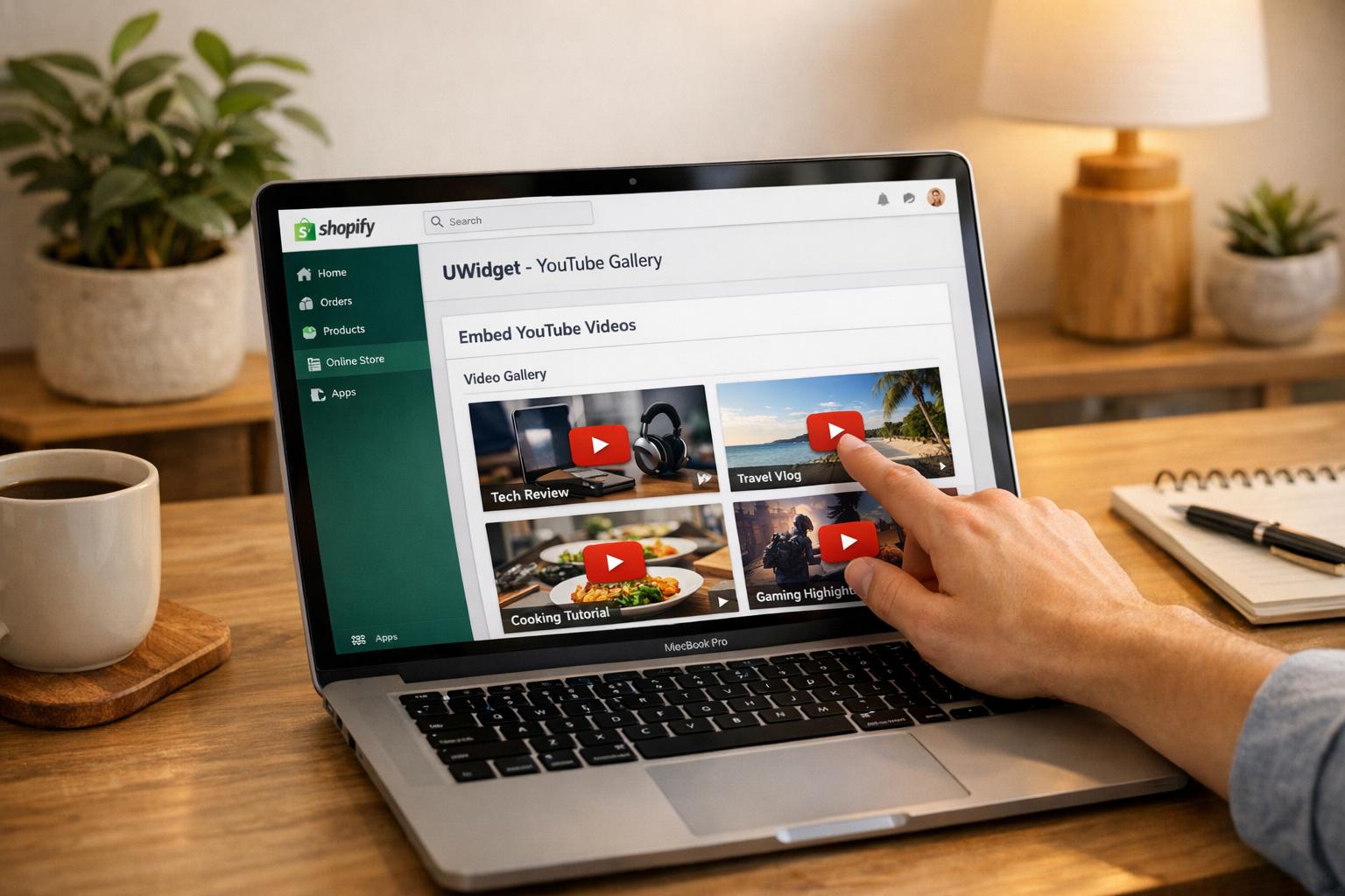
Using UWidget for YouTube Thumbnails
For merchants embedding YouTube videos on their sites, UWidget is a helpful tool. It not only manages thumbnail displays but also integrates videos seamlessly into your store with a lazy-loading feature that ensures thumbnails load quickly.
UWidget offers various layout options - like video galleries, carousel sliders, grids, sticky players, and even banner backgrounds - so you can match the design to your store's look. A merchant from Wholesale Nursery Co shared, "It allows shorts and videos to be displayed and easily integrated on my e-commerce store." Plus, UWidget includes shoppable functionality, enabling product tagging directly on videos, so customers can shop while watching.
Pricing starts at $5.99 per month, with a 7-day free trial. The app also supports custom CSS for tweaking borders, fonts, and colors, and boasts a perfect 5.0/5-star rating on the Shopify App Store. It’s a reliable choice for enhancing video displays on your site. Ready to take the next step? Learn how to upload and optimize your thumbnails in Shopify.
Uploading and Optimizing Thumbnails in Shopify
Adding Thumbnails via Product Media Settings
To add or update thumbnails in Shopify, head to the Products section, select the product you want to edit, and locate the Media section. Click on the video file, then hit the pencil icon next to its cover image. From there, upload a high-resolution thumbnail (1280 x 720, 16:9) from your device. Once done, click X to save your changes.
When choosing the file format, go with PNG for detailed visuals or JPEG if you need a smaller file size (aim for under 2MB). For square images, a resolution of 2,048 x 2,048 pixels works best. Shopify allows up to 250 media items per product, giving you plenty of flexibility to showcase your product from multiple perspectives.
Once your thumbnail is uploaded, take a moment to assess its impact. A well-optimized thumbnail can significantly boost engagement.
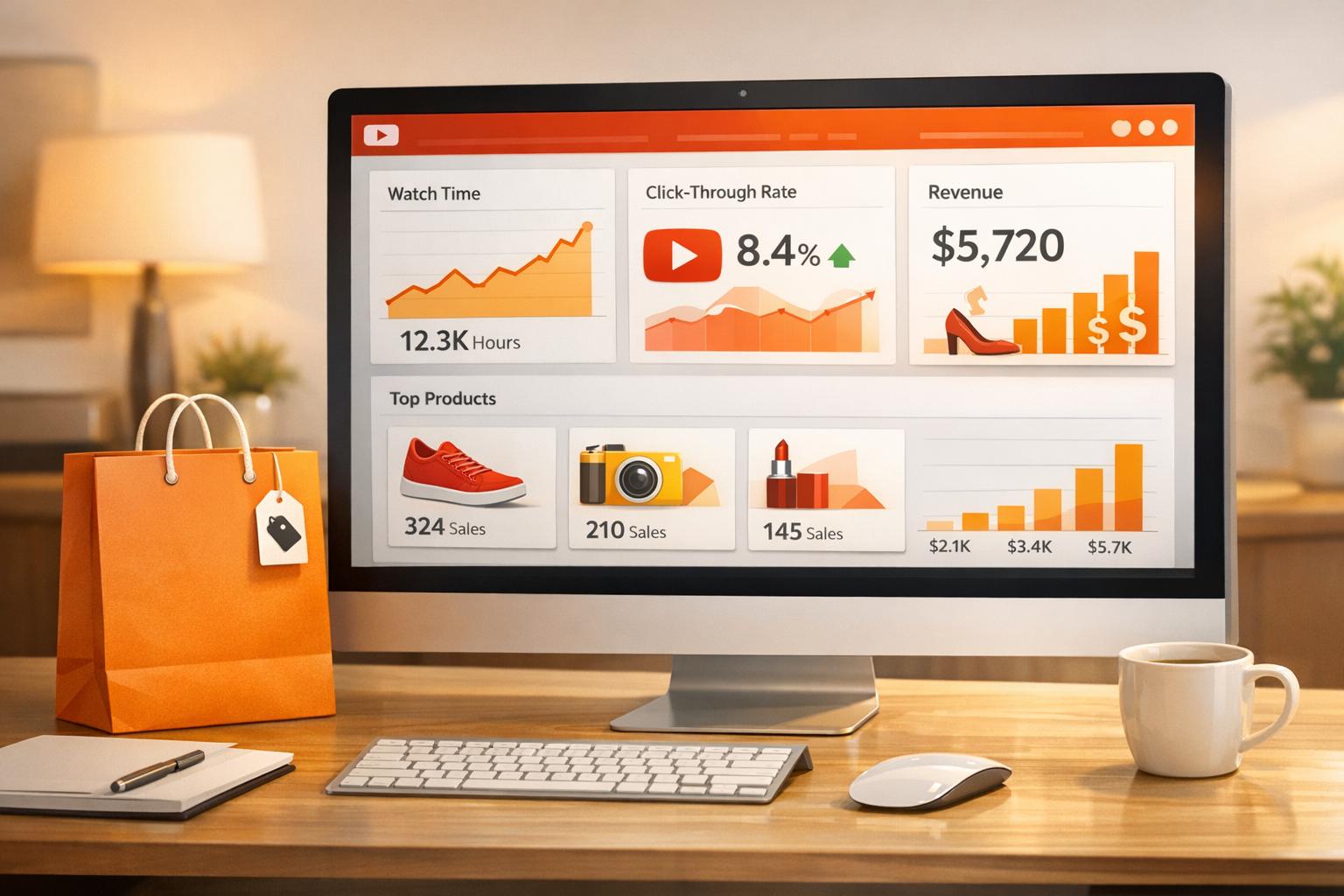
Testing and Analyzing Performance
With over 60% of YouTube views coming from mobile devices, it’s crucial to preview your thumbnail on a smartphone. Check that any text remains clear and the image retains its sharpness, even on smaller screens.
To measure how effective your thumbnails are, Shopify’s built-in analytics can provide insights into click-through rates and overall engagement. For deeper tracking, tools like UWidget can help monitor video widget performance. Experiment with different design elements - such as bold colors, human faces, or striking text - to identify what resonates most with your audience. Small changes can make a big difference in driving clicks and engagement.
Conclusion
To create standout Shopify video thumbnails, stick to a 16:9 ratio (1,280 x 720 px), keep file sizes under 2 MB, and use high-contrast colors paired with bold, readable text. Always check that your thumbnails look sharp on mobile devices.
Thumbnails should be both visually appealing and accurate. Eye-catching designs can increase clicks, but misleading images risk higher bounce rates. Including human faces is a smart move - they build trust and can improve click-through rates.
Consistency plays a big role in brand recognition. Stick to the same fonts, colors, and layout style across all your video thumbnails. This helps customers instantly recognize your brand. Take cues from brands like Luxy Hair, which uses clear text and human faces to deliver on the video’s promise, or James Hoffman, who highlights products with bold, uncluttered text.
Custom thumbnails are a proven strategy - 90% of top-performing YouTube videos rely on them instead of auto-generated options. Professional thumbnails can directly impact engagement. Use Shopify analytics to fine-tune your designs and improve performance. If your store integrates YouTube content, tools like UWidget (starting at $5.99/month with a 7-day free trial) can help manage video galleries and track results, complementing your Shopify video marketing efforts.
Use engagement data to continuously improve your thumbnails and turn more viewers into loyal customers.
FAQs
What makes a Shopify video thumbnail high-converting?
A high-converting Shopify video thumbnail needs to be high-quality, visually appealing, and designed to load quickly. Opt for modern formats like WebP or AVIF to ensure faster performance. An eye-catching thumbnail can grab attention and encourage clicks, ultimately increasing user engagement.
How do I pick a frame that won’t look blurry on mobile?
To make sure your thumbnails look sharp on mobile devices, start with high-quality images that align with Shopify's recommended media specifications. Stick to a clean and simple design, and consider applying the "rule of thirds" to create a balanced and visually appealing composition. If you're adding text overlays, choose fonts that are clear and easy to read, even at smaller sizes.
For better performance and clarity, use lightweight image formats like WebP or AVIF, which load quickly without compromising quality. Also, avoid overly intricate designs, as they can appear cluttered or lose sharpness on smaller screens. Keep it straightforward for the best results.
How can I A/B test thumbnails in Shopify?
To test thumbnails for your Shopify products, you can leverage YouTube's Test & Compare feature. Here's how it works: In YouTube Studio, pick a video, navigate to the thumbnail section, and upload up to three different thumbnail options. Allow the test to run for a few weeks to collect enough data. Once the test concludes, review the results to see which thumbnail delivers the highest click-through rate (CTR). This approach helps you fine-tune your visuals based on real performance metrics, ensuring better engagement.