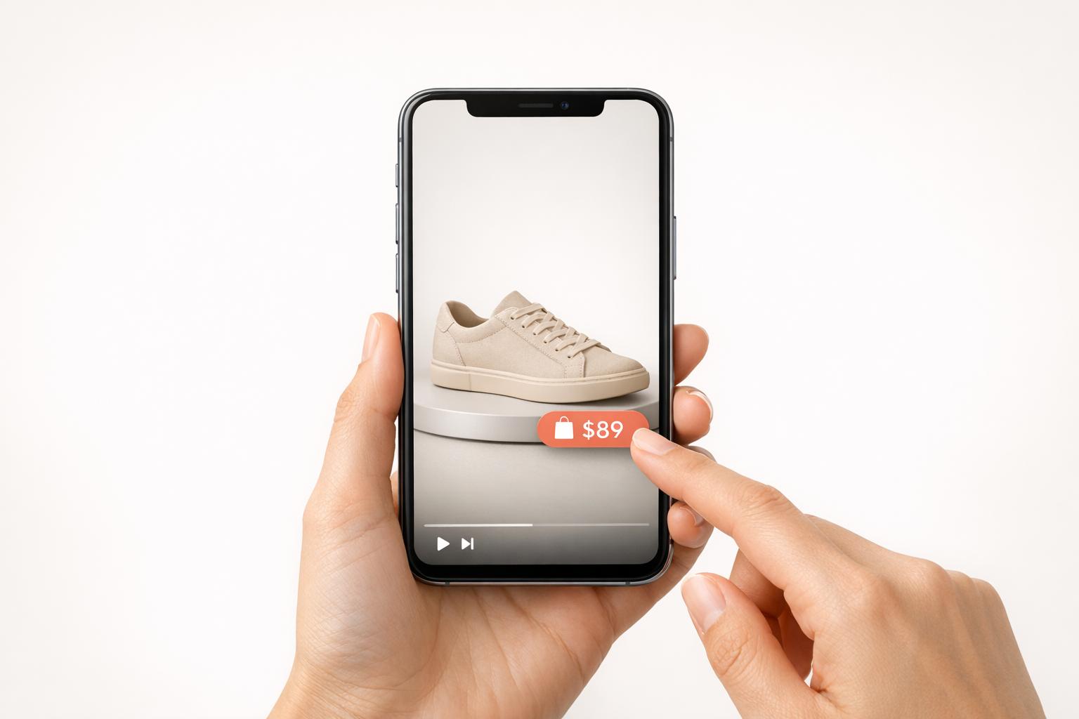
Shoppable videos are transforming how people shop online, especially on mobile devices. These interactive videos let users buy products directly while watching, simplifying the process and boosting sales. With 75% of global video consumption happening on mobile and 82% of consumers making purchases after watching product videos, optimizing these videos for mobile is critical. Here's what you need to know:
- Mobile-First Design: Use vertical (9:16) videos, 1080×1920 resolution, and clear captions for silent viewers.
- Quick Load Times: Employ H.265 compression and lazy loading to prevent users from leaving due to slow speeds.
- Interactive Elements: Add touch-friendly tags and CTAs (minimum size 44×44 pixels) within the first 5–15 seconds.
- Short Videos: Keep videos between 21–34 seconds to match mobile browsing habits.
- Smooth Navigation: Use one-tap product tags and frictionless checkout options like Apple Pay or Shop Pay.
Mobile users demand speed and ease. Shoppable videos, when optimized for smartphones, can increase engagement by 66% and conversions by up to 80%. Whether you're integrating tools like UWidget or testing interactive elements, focusing on mobile UX can turn casual viewers into buyers.
Requirements for Mobile-Optimized Shoppable Videos
Creating mobile-friendly shoppable videos involves integrating the right tools, designing with responsiveness in mind, and ensuring product data stays accurate and up-to-date.
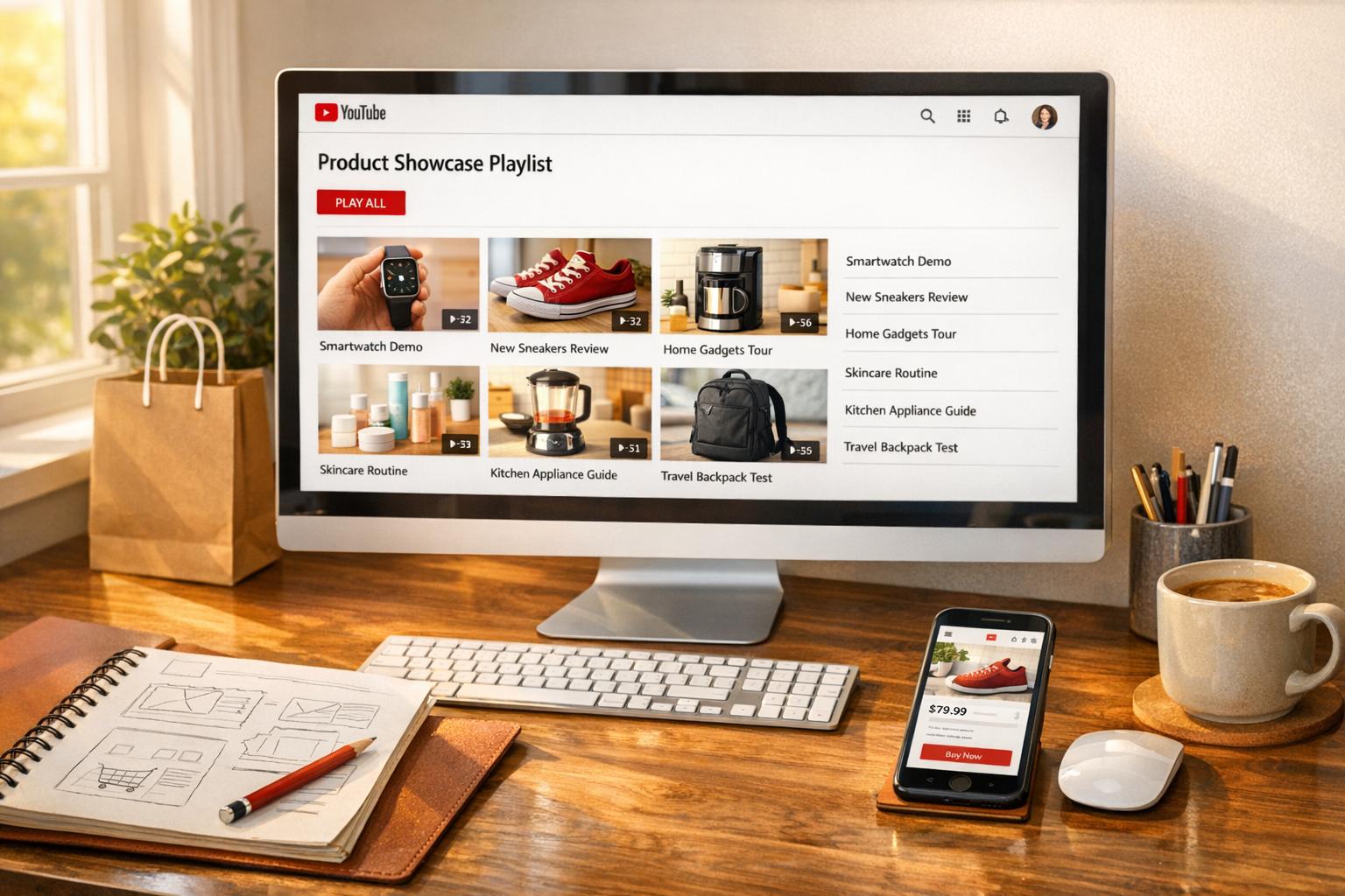
Integration with Shopify Using Video Apps

If you're using Shopify, you can easily incorporate shoppable video features with apps that connect your video content to your product catalog. One such app is UWidget, which lets you embed YouTube videos or Shorts by simply pasting a URL and tagging products directly within the video.
UWidget offers three pricing options:
- Starter ($5.99/month): 1 widget, up to 25 videos
- Pro ($13.99/month): 3 widgets, up to 50 videos
- Premium ($19.99/month): Unlimited widgets and videos
All plans come with a 7-day free trial and an annual billing discount of 17%. Users have rated UWidget a perfect 5.0/5 on the Shopify App Store, praising its ability to boost engagement without slowing down store performance - a critical factor, considering 53% of mobile users leave pages that take more than 3 seconds to load.
Once integrated, focus on tailoring your video format for mobile viewers.
Responsive Video Design
To grab attention on mobile devices, stick to vertical (9:16) videos with a resolution of 1080×1920 pixels. This format has been shown to capture 40% more attention. Keep your videos short - ideally between 21 and 34 seconds - to match the browsing habits of mobile users.
For smooth playback and faster loading, use H.265 (HEVC) compression, which is up to 50% more efficient than H.264, and aim for a variable bitrate of 2–4 Mbps for Full HD videos. Since many viewers watch videos without sound, include clear captions and on-screen text to ensure your message gets across effectively, even in silent mode.
Product Catalog Synchronization
Keeping your product catalog in sync is essential for a seamless shopping experience. Apps like UWidget and the Google & YouTube channel for Shopify automatically link your product inventory to specific video timestamps or hotspots. This ensures that pricing, availability, and product details are always accurate and up-to-date.
With this setup, any changes to your product database - like price updates or stock status - are instantly reflected in your video tags. This automation eliminates manual updates and reduces the risk of outdated information, which can harm conversions. Customers can tap product tags to view the correct product page or add items to their cart without encountering errors or inconsistencies.
| Requirement Category | Technical Specification | Mobile UX Benefit |
|---|---|---|
| Aspect Ratio | 9:16 (Vertical) | 40% more attention |
| Resolution | 1080×1920 pixels | Crisp visuals on high-resolution displays |
| Compression | H.264 or H.265 (HEVC) | Faster loading, lower data usage |
| Loading Method | Lazy Loading | Maintains page speed |
| Bitrate | 2–4 Mbps (Variable) | Smooth playback on 4G/5G |
| Video Length | 21–34 seconds | Ideal for short attention spans |
Designing Interactive Elements for Mobile
When designing for mobile screens, interactive elements need to be easy to spot and use without getting in the way of the overall experience. Let’s dive into some key principles that make mobile interactivity seamless and engaging.
Touch-Friendly Design Principles
Interactive elements, like buttons and hotspots, should be designed with thumbs in mind. A minimum tap target of 44×44 pixels helps reduce tapping errors, aligning with mobile-first UX standards. Position calls-to-action (CTAs) and product tags in areas that are naturally within thumb reach - usually centered or in the lower half of the screen, where users can easily interact without straining. To keep things simple and user-friendly, limit the number of on-screen options to three or fewer. As Jen Bergen from Rapt Media puts it:
"Make any calls-to-action or clickable buttons large – think small screen, big thumbs"
Whenever a user interacts with an element, provide immediate feedback. This could be a color change, a subtle animation, or a button state shift - anything that confirms the action. For text, stick to a minimum font size of 16px and ensure a contrast ratio of at least 4.5:1 for better readability. Finally, aim to introduce the first interactive element within 5 to 15 seconds to quickly engage users.
Non-Intrusive Overlays
Overlays, like product tags, should complement the main content rather than block it. Position them next to the featured product, ensuring they don’t obscure important visuals. To make interactions feel natural, time overlays to appear precisely when the product is being shown or discussed.
Use progressive disclosure to keep things tidy - start with subtle tags that expand when tapped, revealing extra details like price, size, and a "Shop Now" button. All interactive elements should share a consistent visual style to avoid confusion. Given that 90% of consumers watch videos on mobile devices, adding clear captions and on-screen text is a must for accessibility and clarity.
Natalia Petrova, Video Marketer at Firework, emphasizes this approach:
"The golden rule for mobile video design? Keep it simple. Clean, focused, and easy to use on a small touchscreen beats complex and cluttered every time"
Finally, ensure there’s enough spacing between interactive elements to avoid accidental taps. Subtle animations - like pulsing highlights or small arrows - can help guide user attention without becoming a distraction.
Optimizing Video Playback and Loading Speeds
Mobile users demand speed - 53% will leave a page if it takes more than 3 seconds to load. For shoppable videos, every fraction of a second matters. By fine-tuning load times and playback quality, you deliver a seamless mobile experience that complements responsive design.
Adaptive Bitrate Streaming
Adaptive bitrate streaming (ABS) ensures smooth playback by adjusting video quality based on a viewer's internet speed. This system creates multiple versions of your video at different quality levels, automatically serving the best option in real time. For example, if a user moves from Wi‑Fi to 4G, the player shifts to a lower-quality version without interruptions. When the connection improves, it switches back to high resolution. For shoppable videos on mobile, aim for a bitrate of 2–5 Mbps for 1080p content - this strikes a balance between visual clarity and manageable file sizes. Even a 1-second reduction in video startup time can boost viewer retention by 15%. Pairing adaptive streaming with concise, engaging videos ensures a reliable experience across devices.
Short and Engaging Video Content
Shorter videos not only load faster but also suit the way people browse on mobile. Keep your shoppable videos between 15 and 60 seconds. This approach respects both user attention spans and data constraints. Many mobile users rely on cellular connections, so smaller file sizes - ideally between 5 MB and 10 MB - help ensure quick loading. A great example comes from Dr. Dennis Gross, a skincare brand that adopted a video-first strategy in 2023 using Videowise. By optimizing over 150 pages with fast, engaging videos, the brand drove $1 million in orders within a year, achieving a 328x ROI. To maximize impact, grab attention in the first 3 seconds before users scroll away, while keeping the overall runtime lean for instant loading.
Lazy Loading for Improved Speed
Lazy loading is a smart way to reduce initial page weight by deferring video downloads until they're needed. Videos load only when they enter the viewer's screen. For user-initiated videos, use preload="none" to avoid unnecessary loading. In 2023, the apparel brand True Classic revamped its e-commerce site by implementing asynchronous 37 KB scripts and lazy-loaded widgets across 700+ product pages. This strategy kept the site fast while hosting hundreds of videos, resulting in a 13% average conversion rate and $600,000 in influenced orders. As Videowise explains:
"Lazy loading prioritizes critical elements on a page and delays loading non-critical content. If you open a page, lazy loading only loads what's visible on the screen/viewport"
To further enhance the experience, always include a poster attribute. This provides a placeholder image while the video loads, preventing layout shifts and giving users something to see right away.
Streamlining Navigation and Checkout Flows
After optimizing video playback and interactive design, the next step in improving the mobile shopping experience is simplifying navigation and checkout flows. The goal? Make it as easy as possible for users to move from browsing to buying. Even a single extra tap can deter a potential customer. In fact, 17% of US online shoppers abandon their carts because the checkout process takes too long or feels overly complicated.
One-Tap Product Tags
One-tap product tags are a game-changer for mobile shopping. They cut out unnecessary steps by linking users directly to your Shopify cart or product pages. With just one tap, shoppers can navigate to the product they’re interested in or straight to checkout. This approach can increase conversion rates by up to 80% compared to traditional video content.
To make these tags effective, place them in areas that are easy to access - preferably high on the screen where they won’t be blocked by a user’s thumb or app interface. Timing also matters: introduce the first interactive tag within the first 3 to 5 seconds of a video to engage high-intent shoppers right away. For instance, Frankies Bikinis used shoppable, user-generated content strategically and saw 19% of total orders and over 23% of online revenue driven by these interactive elements.
Lastly, make sure clickable areas are large enough to avoid frustrating users. Small or poorly designed tap targets can lead to missed clicks and lost sales. Once users engage, build their confidence with clear progress indicators.
Progress Indicators to Boost Engagement
Progress indicators are a simple yet effective way to guide users through the checkout process. By visually showing stages like Shipping, Payment, and Confirmation, they reduce the perceived complexity of the transaction. Tools like CheckIt can add a clean, unobtrusive progress bar at the top of the screen.
You can also use progress bars creatively to encourage higher cart values. For example, an incentive-based bar that tracks progress toward free shipping can motivate users to add more items to their cart. While progress indicators smooth the path, the checkout process itself needs to be as frictionless as possible.
Frictionless Checkout Processes
Mobile devices have the highest cart abandonment rate at 85.65%, making it essential to eliminate any obstacles in the checkout process. Start by offering express payment options like Shop Pay, Apple Pay, Google Pay, and PayPal. These methods significantly speed up transactions - mobile checkout conversion rates are 1.91 times higher for Shop Pay checkouts than for standard ones.
Avoid forcing users to create an account, as 24% of US shoppers abandon their carts for this reason. Instead, simplify data entry by using a single "Full Name" field and auto-detecting keyboards (e.g., numeric keyboards for phone numbers and zip codes). Display shipping costs, taxes, and delivery dates early in the process to manage expectations.
As Benjamin Sehl, Co-founder of Kotn, points out:
"The majority of our customers today are discovering new products on the go on their mobile devices, and if they have to fill out a form, we've lost them."
Keep the checkout interface thumb-friendly with large, easy-to-tap buttons. Provide immediate feedback - like a green checkmark for correct entries or a red "X" for errors - so users can address issues as they go instead of being surprised at the end. These small but impactful changes can make the difference between a completed purchase and an abandoned cart.
Cross-Device Testing and Responsiveness
Once you've simplified your checkout flows, the next step is ensuring your shoppable videos work seamlessly across all devices. With 75% of global video consumption happening on mobile devices, assuming consistent performance across all screens is a risk you can’t afford to take. Device type, screen size, and network conditions all play a role in how your videos perform.
Start by testing on both emulators and real devices. Emulators are great for quick checks, but they can’t always mimic real-world issues like touch sensitivity or hardware-specific quirks. Testing on actual devices helps uncover these problems. Check how your videos perform across various screen sizes and resolutions to ensure interactive elements like buttons remain accessible. Also, test under different network conditions - 4G, 5G, and Wi-Fi. This is crucial since 53% of users abandon a page if it takes longer than three seconds to load. Dive deeper into these variables with targeted testing to see how they impact user interaction.
Don’t forget to test in both portrait and landscape modes. While smartphone users hold their devices vertically 94% of the time, 72% of millennials never rotate their phones horizontally when watching videos. This makes it essential to keep product tags and “Buy Now” buttons visible and easy to tap, no matter the orientation. Vertical videos are especially effective, capturing 13.8% more screen space on mobile devices, which boosts visibility and interaction rates.
Testing on iOS and Android Devices
Testing on both iOS and Android platforms is non-negotiable. iOS devices are known for their consistency, but Android’s wide range of devices can introduce compatibility challenges. To cover your bases, test on the latest iPhones and iPads, as well as a variety of Android devices from different manufacturers. Each brand may handle video playback differently, so it’s important to check for device-specific issues.
Keep an eye on QoS (Quality of Service) metrics like playback error rates and device compatibility to identify potential hardware-related failures. Make sure your interactive elements are touch-friendly: buttons should be large enough for thumbs and spaced out to avoid accidental taps. Also, ensure text is legible - use a minimum font size of 16px and maintain a contrast ratio of at least 4.5:1 for readability, even in outdoor lighting conditions. Once you're confident in your hardware and OS performance, use heatmaps to fine-tune the placement of interactive elements.
Using Heatmaps for Interaction Insights
Heatmaps are a powerful tool for understanding how users engage with your shoppable videos. They visually map out where users are tapping, helping you identify poorly placed hotspots or areas where accidental taps occur. By analyzing this data, you can adjust hotspot placement and further improve the mobile user experience.
sbb-itb-d9e5b3a
Boosting Engagement with Mobile-Specific Features
Mobile engagement can skyrocket when you incorporate the right features tailored specifically for mobile users. With 90% of consumers watching videos on mobile devices and shoppable videos being 66% more engaging than standard formats, these tools can turn casual browsers into active buyers. By focusing on mobile-optimized elements, you create a seamless, interactive shopping experience that keeps users engaged.
Sticky and Auto-Playing Videos
Sticky videos - those that stay visible as users scroll - are a powerful way to keep attention without disrupting the flow of browsing. Combine this with auto-play functionality (muted by default), and you grab viewers’ attention immediately. This is crucial because you only have 3 to 5 seconds to hook them.
"Shorter videos win, but only if your shoppable tags appear before the viewer starts debating whether to skip." - Samantha Becker, Head of Customer Success, Tolstoy
A great example of this strategy in action is Walmart’s December 2020 live shopping event on TikTok. Featuring influencers and a fashion line, the event drew over 10 million views - 7x more than Walmart’s average live stream - and resulted in thousands of items being added to carts in real time. Similarly, OCEEDEE, a luxury footwear brand, used shoppable stories to achieve a 3x increase in conversion rate to 2.86% and recorded over 7,600 video clicks in just 30 days.
Personalized Tags Using Shopify Data
Customizing shoppable videos takes things to the next level. Generic product tags often fall flat, especially on mobile. Instead, tap into Shopify data like browsing history, purchase behavior, and abandoned carts to create personalized product recommendations. For instance, a user searching for winter jackets should see tags highlighting new arrivals or related accessories. This approach works: personalized calls-to-action convert 202% better than generic ones.
Take Ava Estell, for example. By integrating personalized tagging into their shoppable videos, they achieved a 23% engagement rate and a 21% conversion rate, generating nearly $975,000 in additional revenue. Similarly, Apolla, a compression sock company, used user-generated content in their videos, reaching a 21.47% engagement rate and a 9.94% conversion rate, which brought in over $193,800. To avoid overwhelming viewers, include 3 to 4 clickable items per video - this prevents decision fatigue.
Widgets for Enhanced Video Interactivity
Interactive widgets can transform passive viewing into an engaging experience. Tools like UWidget allow you to add features such as YouTube playlists, shorts, carousels, and sticky videos - all designed with mobile screens in mind. Swipeable reels and TikTok-style feeds are particularly effective for encouraging product discovery and exploration.
Skin Rocks saw the impact of this firsthand in 2025 when they added shoppable video widgets to their Product Detail Pages. These widgets, featuring user-generated content, led to a 14% increase in conversion rates by showcasing authentic product demonstrations that built trust. Additionally, interactive videos can drive 300% more engagement compared to static ones, and viewers spend 47% more time interacting with these formats. Remember to make buttons thumb-friendly and limit on-screen choices to three at a time to ensure ease of use.
Desktop vs. Mobile UX for Shoppable Videos
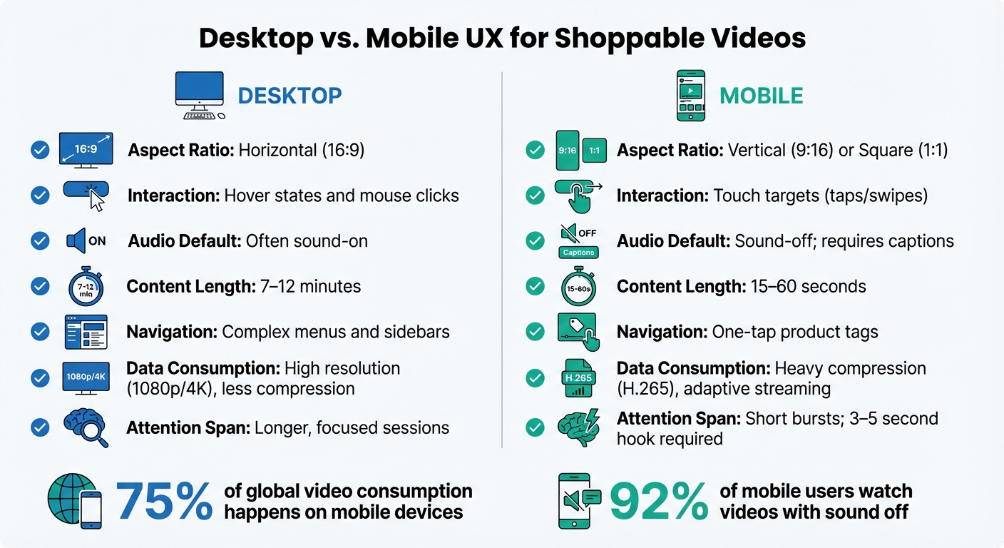
Mobile vs Desktop Shoppable Video UX Requirements
When it comes to shoppable videos, the user experience on desktop and mobile differs significantly, and understanding these distinctions is key to creating effective content. While 75% of global video consumption happens on mobile devices, the way users interact with videos on mobile versus desktop can vary based on their behavior and environment. Mobile users often engage with content in short bursts, like during commutes or while multitasking, whereas desktop users tend to have longer, more focused viewing sessions.
On desktop, users benefit from precise cursor control and hover states, making interactions more detailed. In contrast, mobile interfaces depend on touch gestures, such as taps and swipes, which require larger, thumb-friendly targets. Audio preferences also differ: 92% of mobile users watch videos with the sound off, making captions and strong visual cues essential. Desktop viewers, however, are more likely to have sound enabled, allowing for richer audio experiences.
"Mobile commerce is transforming retail at breakneck speed. By 2025, mobile will dominate online shopping, with users overwhelmingly preferring apps over websites."
- Natalia Petrova, Video Marketer
Technical constraints also play a role. Mobile devices often have limited processing power and rely on cellular data, so optimizing file sizes and compression is critical. Meanwhile, desktop users, with access to high-speed internet and greater bandwidth, can enjoy higher resolution videos without the same concerns about loading times.
Comparison Table: Desktop vs. Mobile
| UX Element | Desktop | Mobile |
|---|---|---|
| Aspect Ratio | Horizontal (16:9) | Vertical (9:16) or Square (1:1) |
| Interaction | Hover states and mouse clicks | Touch targets (taps/swipes) |
| Audio Default | Often sound-on | Sound-off; requires captions |
| Content Length | 7–12 minutes | 15–60 seconds |
| Navigation | Complex menus and sidebars | One-tap product tags |
| Data Consumption | High resolution (1080p/4K), less compression | Heavy compression (H.265), adaptive streaming |
| Attention Span | Longer, focused sessions | Short bursts; 3–5 second hook required |
Each platform has its strengths and challenges, so tailoring your shoppable video strategy to these differences can make all the difference in engaging your audience effectively.
Measuring and Iterating Mobile Video Performance
Tracking the right metrics is what separates a successful shoppable video campaign from one that simply drains your budget. Shoppable videos have the potential to increase conversion rates by up to 80% compared to static content, but that only happens if you're focusing on the right data and making informed adjustments.
Key Performance Indicators (KPIs)
To gauge the success of your mobile video, start with engagement metrics. For instance, View-Through Rate (VTR) indicates the percentage of viewers who watch at least 75% of your video - a critical measure since viewer attention peaks in the first 15 seconds. Other engagement metrics include the time spent watching and where viewers tend to drop off.
On the conversion side, keep an eye on:
- Click-Through Rate (CTR): Tracks how many viewers tap on product tags or calls-to-action.
- Conversion Rate: Measures completed purchases.
- Add-to-Cart Rate: Shows whether users are interested but hesitant to buy.
Interactive videos, in particular, can achieve CTRs up to 10 times higher than passive ones.
Technical performance is equally important, especially on mobile devices. Metrics like video startup time, rebuffering rate (how often the video pauses to load), and playback error rate directly affect user experience. Remember, 53% of mobile users will abandon a page if it takes more than 3 seconds to load.
Finally, financial metrics tie everything back to revenue. Key figures like Return on Ad Spend (ROAS), Average Order Value (AOV), and Revenue Per Click (RPC) link video performance to actual dollars. Make sure to distinguish between direct sales (purchases made directly through the video player) and influenced sales (purchases made after watching at least 5 seconds of the video without using the in-video checkout).
These metrics should serve as your foundation for ongoing testing and optimization.
A/B Testing for Iterative Improvements
Once you’ve identified the right KPIs, A/B testing becomes your go-to tool for refining your shoppable video strategy. The key is to test one variable at a time, so you can pinpoint what’s driving results. Before running a test, create a clear hypothesis using this formula:
"Because we see [data/feedback], we expect [change] will cause [impact], measured by [metric]".
For example: "Because we see high views but low CTR, we expect moving the CTA to the bottom-right corner will increase taps by 15%, measured by CTR."
Here’s a real-world example: In 2025, a beauty brand using Firework's platform tested different CTA placements in their shoppable videos. When they moved the CTA to the bottom-right corner of the mobile screen, their click-through rates jumped by 15%. Another beauty brand found success by front-loading product tags within the first 15 seconds of their videos, resulting in a 25% boost in overall CTR.
For meaningful results, run your tests for two to four weeks to account for varying traffic and buyer behaviors. Break down your results by device type and video placement. If views are high but CTR is lagging, experiment with the timing and visibility of your CTA. If CTR is strong but conversions are low, it might be time to audit your mobile landing page for potential friction points.
Visual tools like heatmaps can also provide valuable insights. Heatmaps show where users are tapping within your video frame, helping you optimize interactive elements without relying on guesswork. For example, a lifestyle brand noticed high engagement but low conversions. After examining their mobile landing page, they made adjustments that led to a 40% increase in conversions.
Conclusion
As we’ve explored, creating effective mobile shoppable videos requires a mix of thoughtful design, quick load times, and engaging interactivity. With mobile devices accounting for 75% of global video consumption, nailing these elements isn’t just a nice-to-have - it’s a must to remain competitive.
Start by focusing on touch-friendly design. Interactive elements should be large enough for easy tapping and spaced well to avoid accidental clicks. Include product tags within the first 3 to 15 seconds to grab the attention of high-intent shoppers right away. To keep things simple and user-friendly, limit on-screen options to no more than three at a time. And don’t forget to prioritize vertical or near-vertical formats to make the most of mobile screen space.
Speed is another critical factor. With 53% of mobile users abandoning pages that take more than 3 seconds to load, optimizing performance is essential. Techniques like H.265 compression and adaptive bitrate streaming aren’t just technical details - they directly impact conversion rates. For instance, websites that load in under 1 second boast a 3.05% conversion rate, nearly double the 1.68% rate of sites that take 2 seconds.
To streamline implementation, tools like UWidget integrate seamlessly with your Shopify storefront. They support vertical video formats and offer built-in analytics to help you track performance. By combining smart design choices, optimized speed, and tools like UWidget, you can turn casual viewers into loyal customers. Interactive videos alone have the potential to boost conversion rates by up to 80%. Implement these strategies today to transform your mobile shopping experience.
FAQs
What makes shoppable videos a game-changer for mobile shopping?
Shoppable videos are reshaping the mobile shopping experience by letting users purchase items directly from the video they’re watching. No extra clicks or navigating away - just a smooth, straightforward process that saves time and effort.
These videos are crafted for today’s short attention spans, grabbing interest almost instantly. They offer an interactive and engaging way to shop that fits seamlessly with how people use their phones. By simplifying the path to purchase, shoppable videos not only make shopping easier but also help increase conversions and leave customers feeling more satisfied with their experience.
What are the key tips for creating mobile-friendly shoppable videos?
To craft mobile-friendly shoppable videos that truly connect with users, aim for a smooth and engaging experience. Keep your videos short - somewhere between 15 and 60 seconds - to align with the shorter attention spans of mobile viewers. Stick to a vertical (9:16) format since it perfectly matches mobile screens and tends to grab attention more effectively.
Add interactive features like clickable product tags or buttons, making it easy for viewers to shop directly without leaving the video. Make sure the videos load quickly, are optimized for mobile resolutions, and include subtitles for those watching without sound. By focusing on visually striking, interactive, and mobile-ready content, you'll not only hold attention but also encourage more conversions.
What are the best ways to make shoppable videos load faster on mobile devices?
To ensure your shoppable videos load quickly on mobile devices, prioritize video compression and mobile-optimized formats. Use compression standards like H.264 or H.265 to shrink file sizes while maintaining high-quality visuals. Also, format your videos for mobile screens - vertical (9:16) or square (1:1) aspect ratios work best for smaller displays.
Keep the videos short and test them across different mobile devices to confirm smooth playback. Hosting your videos on a dependable platform with fast content delivery networks (CDNs) can further enhance loading speeds.